Content may contain affiliate links. When you shop the links, I receive a small commission at no cost to you. Thank you for supporting my small business.
Repose Gray by Sherwin Williams (SW 7015) is the perfect warm gray neutral paint color for every room in your home. With slight green and taupe undertones, it looks gray without ever feeling cold.
Repose Gray is my go-to neutral gray paint color choice. It’s the perfect whole-house paint color that works in ANY room, no matter whether the room has cool or warm light. I love it so much that I’ve used this warm gray paint color all over my own home!
If you’ve been looking for the perfect gray that never reads cold, you’re going to love this post. I’m sharing all the must-know details about this paint color, including its undertones, LRV, comparisons, and lots of photos to help you decide if it’s the one for you.
Is Repose Gray a Warm or Cool Color?
Repose Gray is a little closer to warm gray than a true “greige” but is still warm enough for me to consider it under that category. The warmth it has makes it perfect for any room in your home, be it a living space, kitchen, bathroom or bedroom.
If you’ve been wanting to add gray paint to a room in your home but you’re worried about cool light that tends to bring out blue undertones in everything, then I think Repose Gray will be perfect for you. It will never feel like a cold gray, which is why it is so incredibly versatile.
That’s the exact reason I stumbled upon it! All the other grays I was trying looked distinctly baby blue in our kitchen but this paint color had just enough hint of warmth to still look medium gray and never at all cold.
If you want to minimize the beige undertone for a cleaner gray, I would stick to keeping it in bright spaces as the beige (and slight green undertone) really comes out in darker spaces. Not that I don’t like that, I actually really love how this gray never feels cold.
On the other hand, if you’re reading this and now realize you don’t want a warm gray, then a cooler gray like Gray Owl or Stonington Gray may be more what you’re looking for.
Don’t Forget To Always Use Real Paint Samples!
Don’t forget – no matter what you’ve read or photos you’ve seen online, it’s really important to sample paint colors in your home before committing!
Samplize provides peel and stick paint samples made with real paint, that are easy to move around your home, and cheaper than buying a gazillion paint pots! It’s the only way I buy paint samples.
What is the LRV of Repose Gray?
Repose Gray has an LRV of 58, making it medium-toned color.
Is it a True Gray?
Sorry to burst your bubble, but there’s really no such thing as a true gray. Every gray has some sort of undertone – whether it’s brown, blue, purple, or taupe. Of course, some grays are more closer to a neutral, “true” gray than others.
While Repose Gray is no different in that it has undertones, many people have found it to be the perfect true gray for them.
What are Repose Gray’s Undertones?
Repose Gray technically has a beige/taupe undertone as well as some green. The beige adds warmth and it could possibly flash slightly pink or purple due to those taupe tones. It can also have the slightest green undertone in darker rooms, or in shadowy corners in particular.

Don’t be scared, though! These undertones make it a unicorn paint color that works equally well when paired with both cool and warm colors in your home! Woohoo!
If your only experience of warm grays or greiges is the ever popular Benjamin Moore Revere Pewter – you’ll be surprised at how much more gray Repose Gray is. Revere Pewter can be quite muddy, whereas Repose Gray never looks that way.
This also means that it will work with a variety of finishes throughout your home AND it’s also one of the best paint colors for resale value.
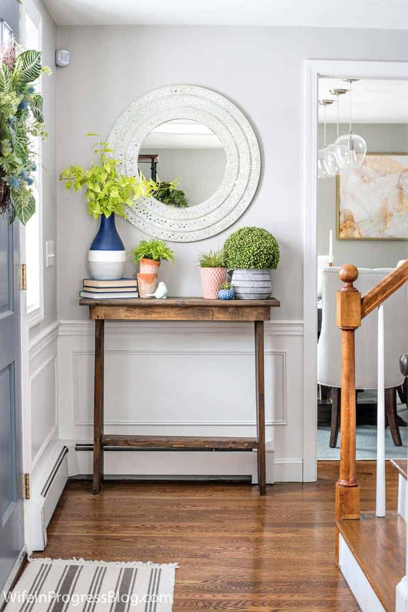
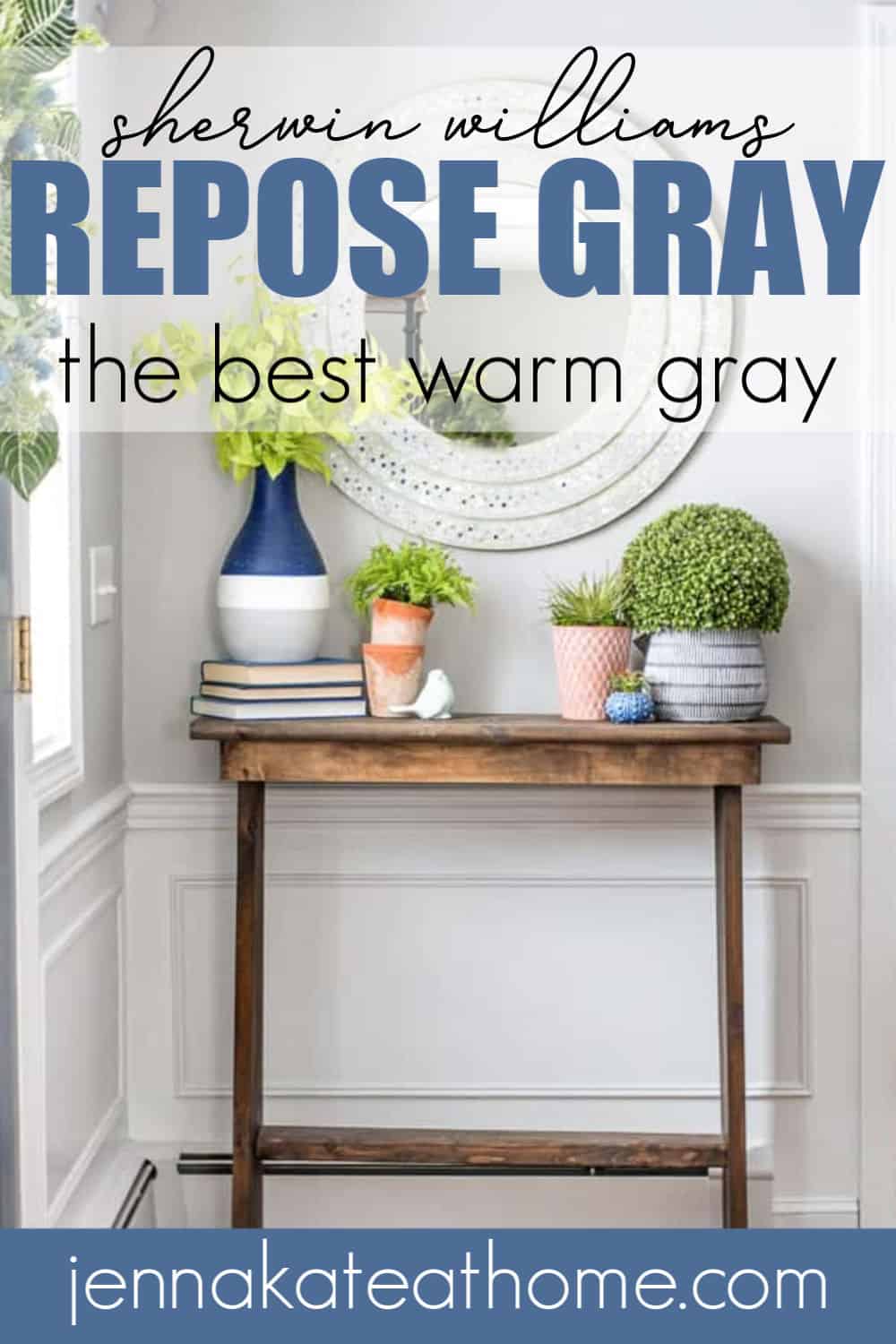
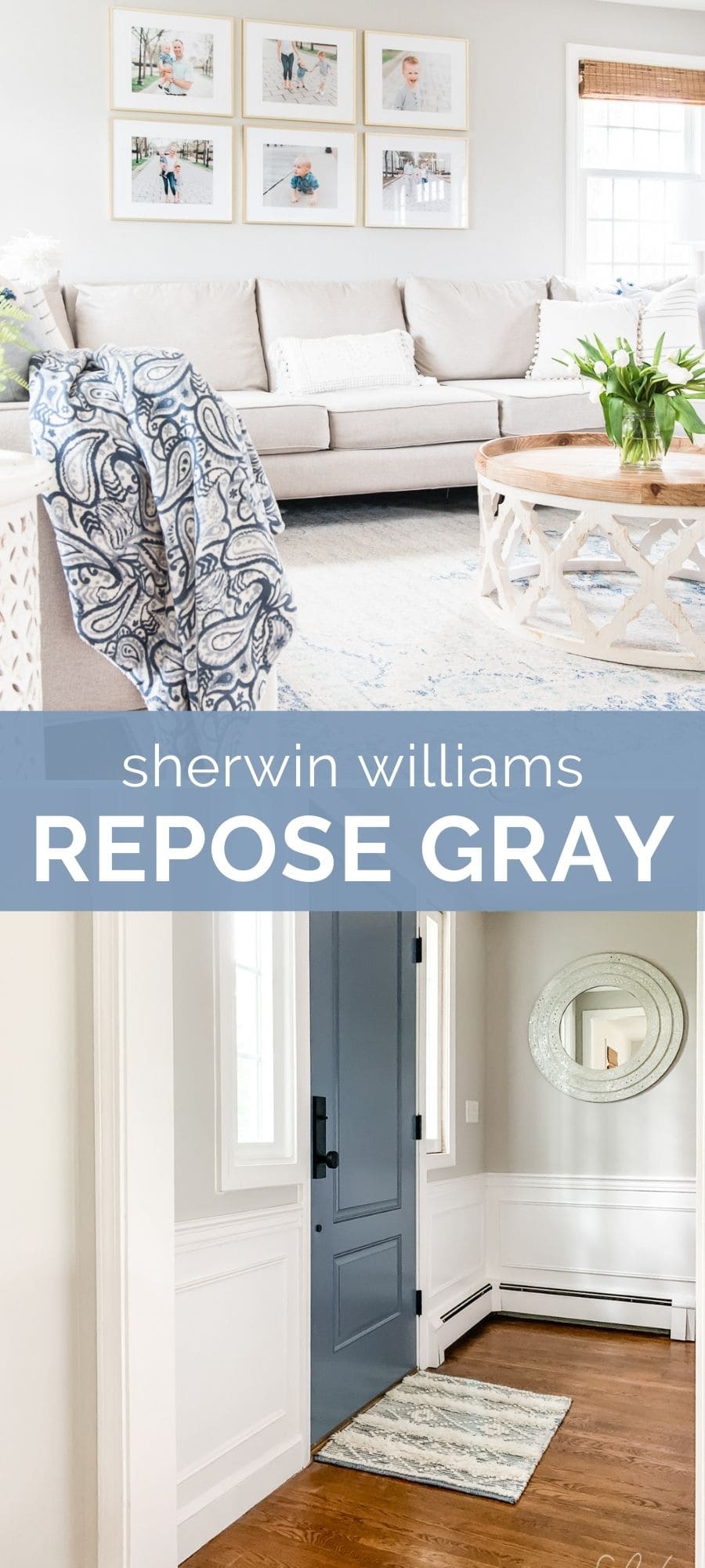
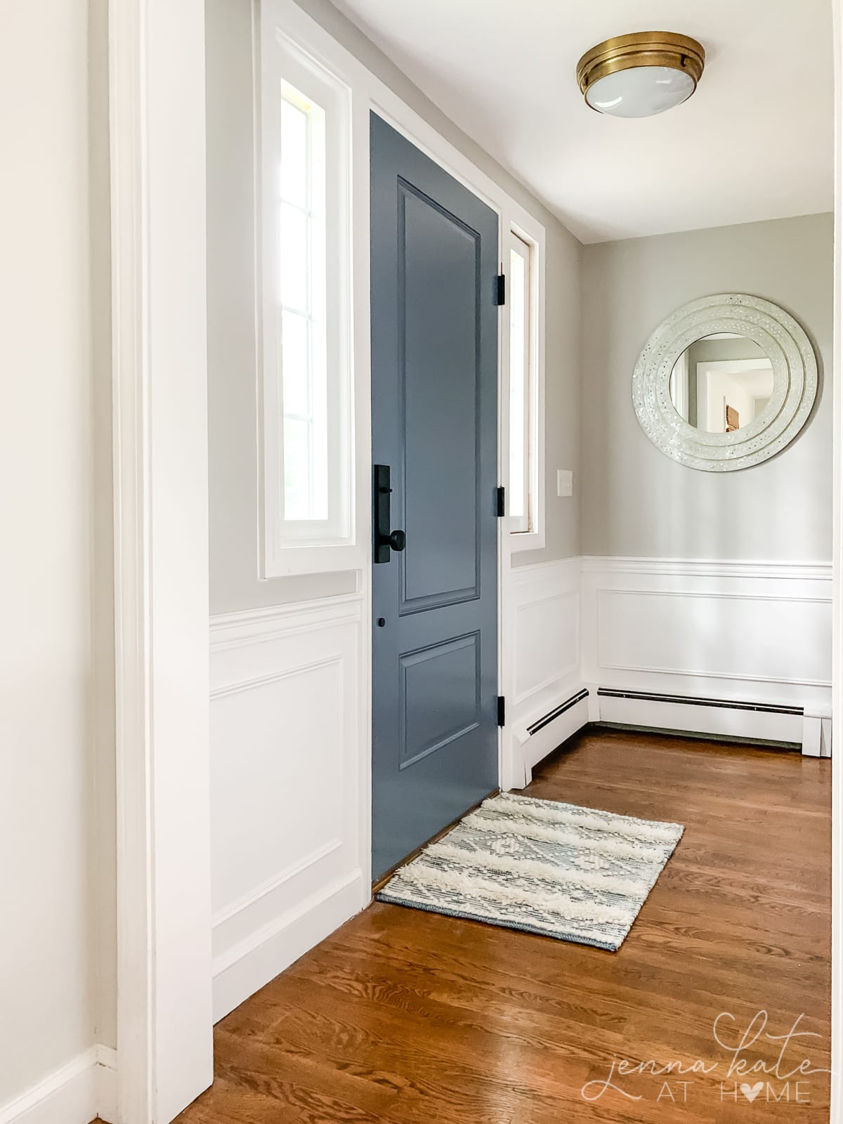
The picture above was taken right inside my front door. While the light is much warmer here than in the kitchen, Repose Gray still just has that touch of warmth to it. It’s really the perfect undertone for a gray that you will want to use throughout your home because regardless of the type of light, it will work.
Looking for a paint color that’s lighter? I definitely recommend reading more about Sherwin Williams City Loft.
What White Trim Color Goes With Repose Gray?
Because Repose Gray works so well with both warm and cool colors, any of the white trim paint colors will work well.
If you want a bright, crisp white then Sherwin Williams Extra White or Benjamin Moore Chantilly Lace are good choices.
For a neutral white, Sherwin Williams Pure White is always a safe bet. If you want a creamier, warmer white then Benjamin Moore Simply White or White Dove are good contenders.
Is Repose Gray a Good Whole House Paint Color?
Yes! There are not a lot of paint colors that I can confidently say will work in every room of your home. Because each part of your home will have different light, depending on whether the windows are north, south, east or west facing, a paint color that works in one room may look horrible in another.
Repose Gray looks great in all exposures! However, in the darker rooms, that green undertone comes to the fore a little more. To counteract this, I started lightening the color by 50% and ended up with the PERFECT paint color! The lighter color has much less of the green undertone obvious and truly works in any room!
If this is something you want to do, just go to the paint store and ask for “Sherwin Williams Repose Gray lightened by 50%” and they will know what you mean.
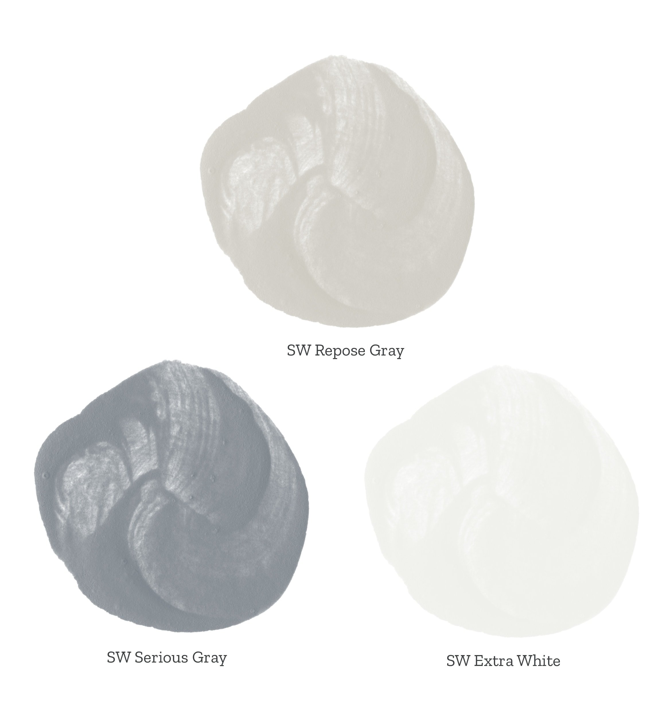
Repose Gray Coordinating Colors
One of the colors that goes really well with it is this lovely gray-toned blue (Serious Gray by Sherwin Williams). Something about the gray-blue tone really complements it so well! (read more about my favorite blue-gray paint colors here).
If you want to accent it with a similar color but one that’s a bit darker for contrast, then Dorian Gray makes for a nice bold accent color.

If you love how it look, but want a slightly lighter and brighter color, it looks equally amazing when lightened by 50%. I recently repainted my living room using it at 50% strength and I really wish I had done it sooner!
Additionally, paired with crisp white trim, Repose Gray gives a really fresh modern feel to any room.
What White Paint Colors Work With Repose Gray?
Because Repose Gray has both warm and cool undertones, you can pair it with most white paint colors for trim and other accents. I personally love it with SW Pure White, because it’s the perfect slightly warm white that works with all color schemes.
However, you could choose a cooler white like SW Extra White if your color scheme is predominantly cool, or a warmer white like SW Alabaster if you want a softer look.
Repose Gray vs Agreeable Gray
Agreeable Gray is another very popular warm gray or greige paint color.
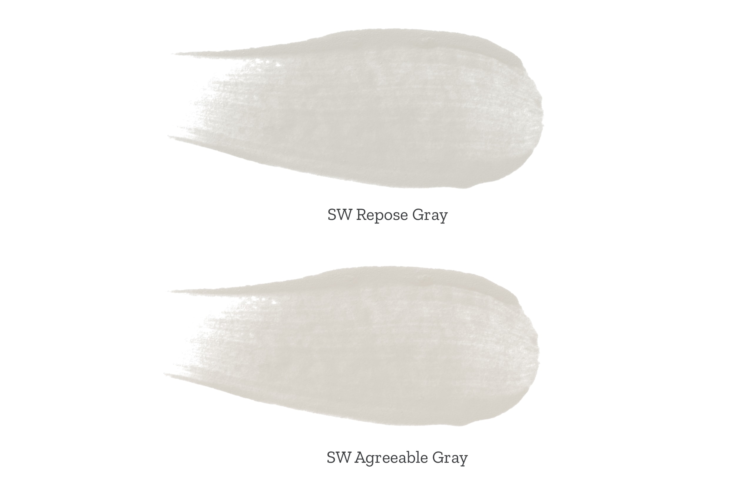
Repose Gray is a bit more gray than Agreeable Gray, which has a stronger beige undertone, making it more of a greige. So Repose Gray is cooler, but it’s still a warm gray. It’s also just a smidge darker than Agreeable Gray, but the difference is barely noticeable.
If you’re deciding between the two, my main question for you would be whether you want more of a gray paint color or something warmer. If you want a color that’s warmer, then Agreeable Gray would be the way to go.
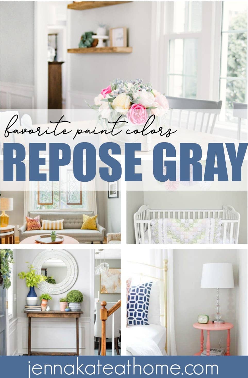
Real Room Examples
I want to share with you some other spaces that have used this wonderful color. If you have cooler light or a north facing room and cannot find the right gray, definitely try Repose Gray.
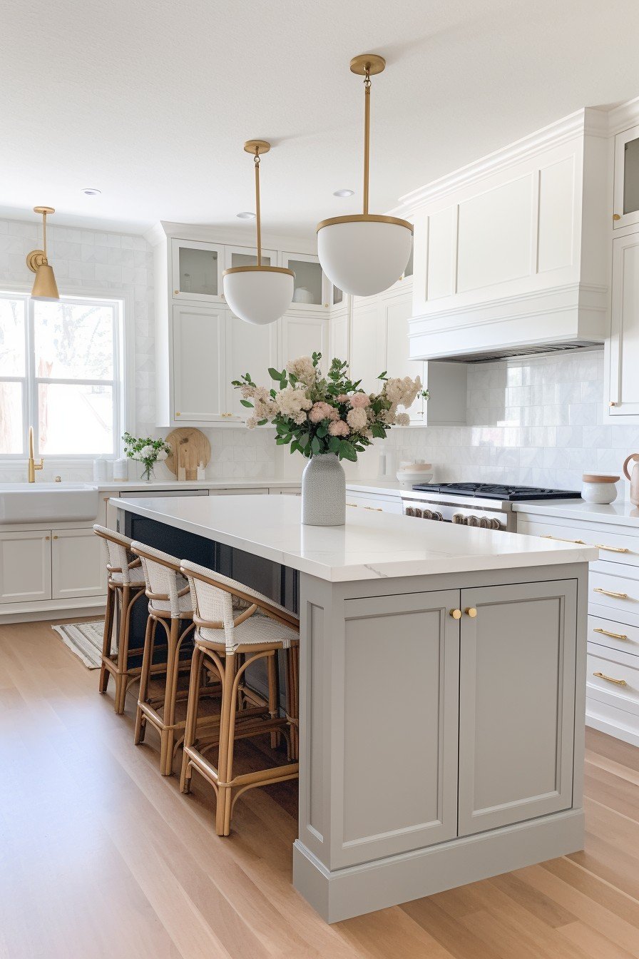
Can Repose Gray be Used as a Cabinet Color?
Yes! Not only is it a lovely wall color, but Repose Gray is one of my favorite colors for cabinets. Whether you prefer brass, black or silver hardware, it will work with all of them!
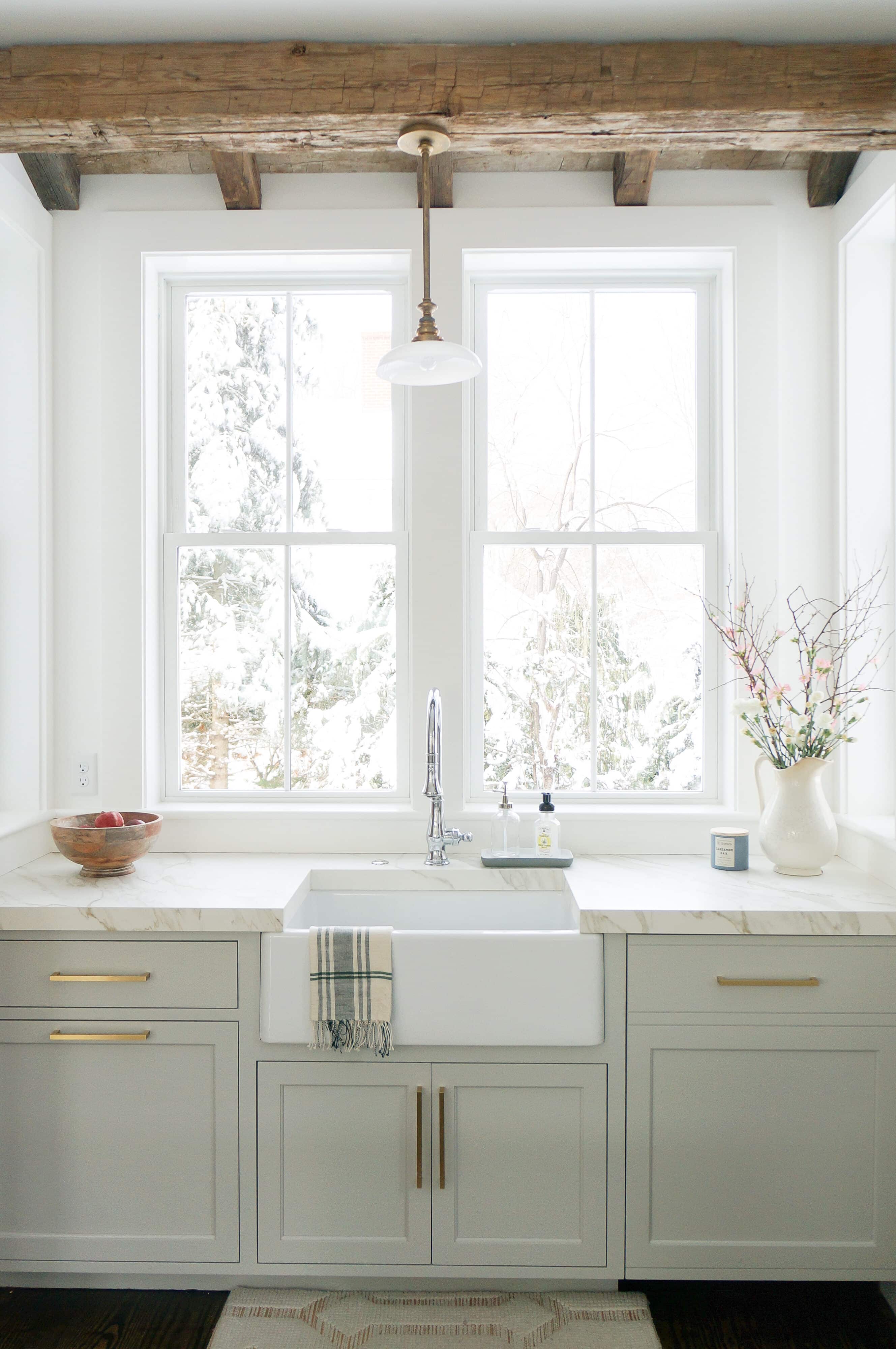
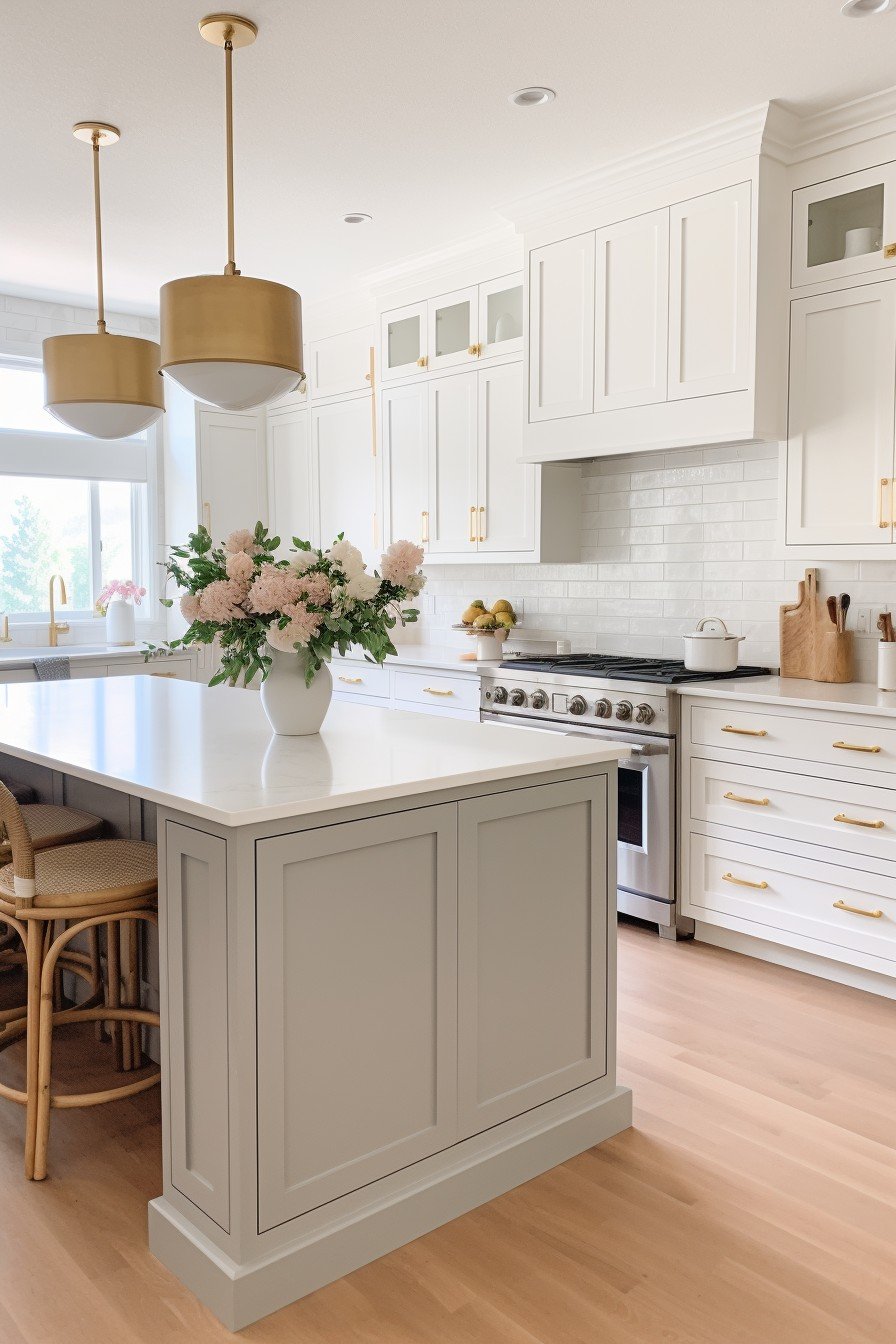
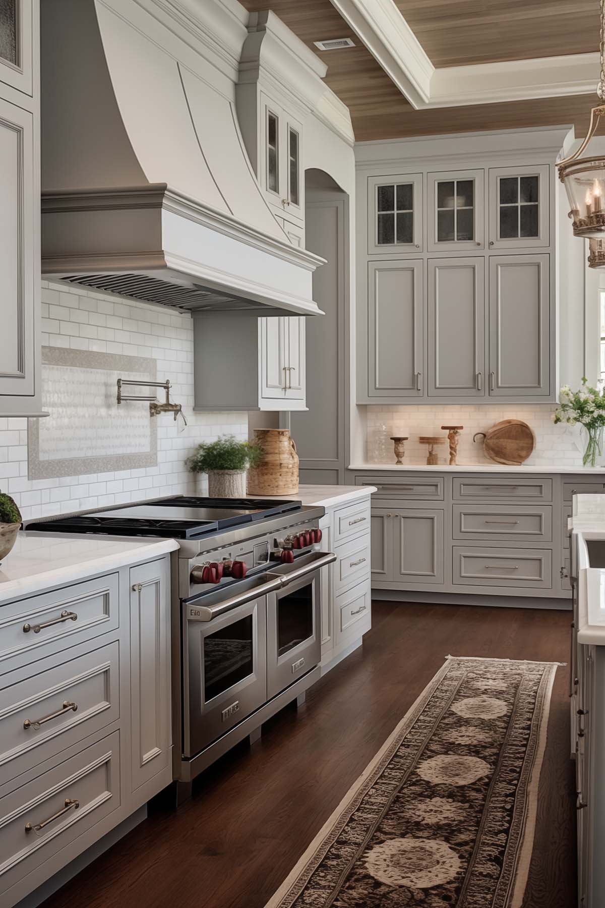
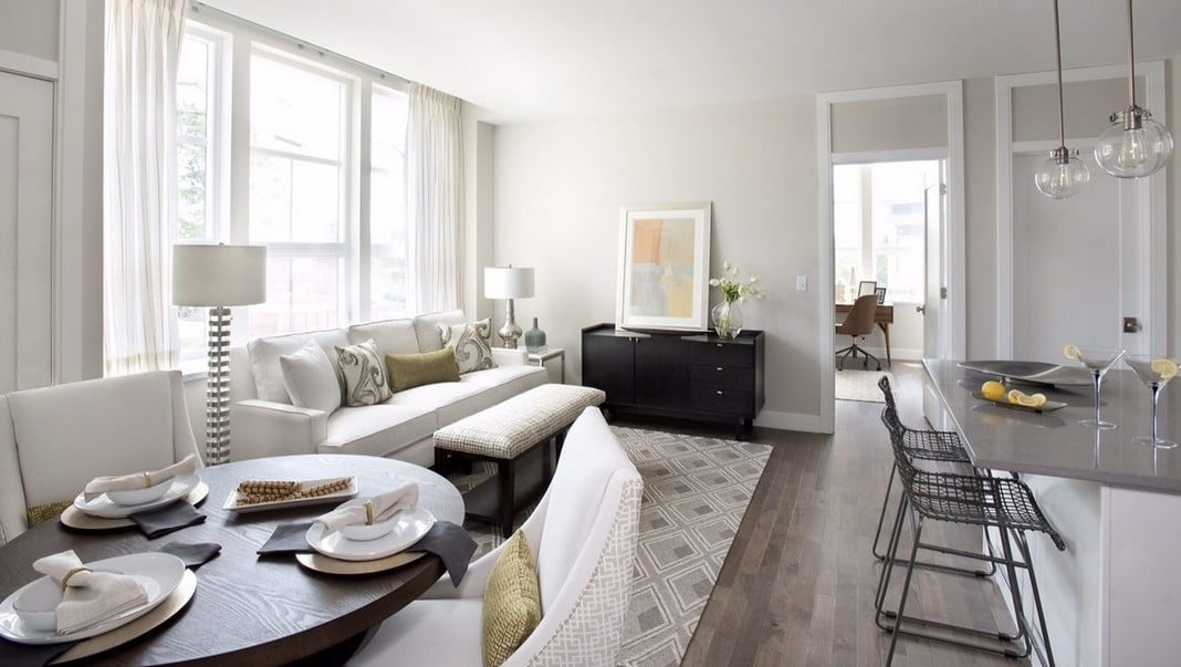
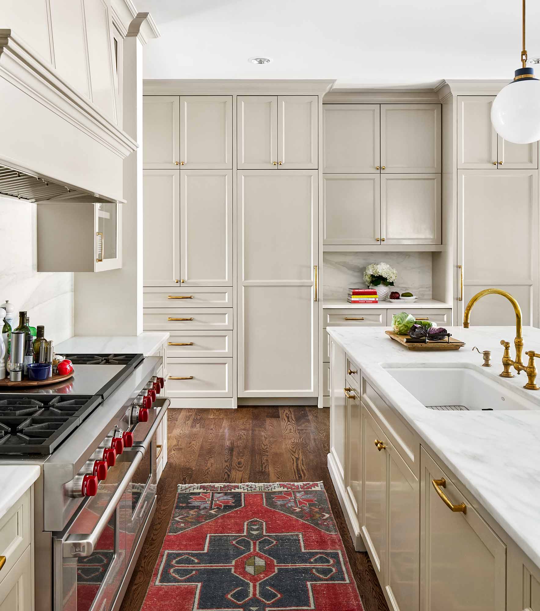
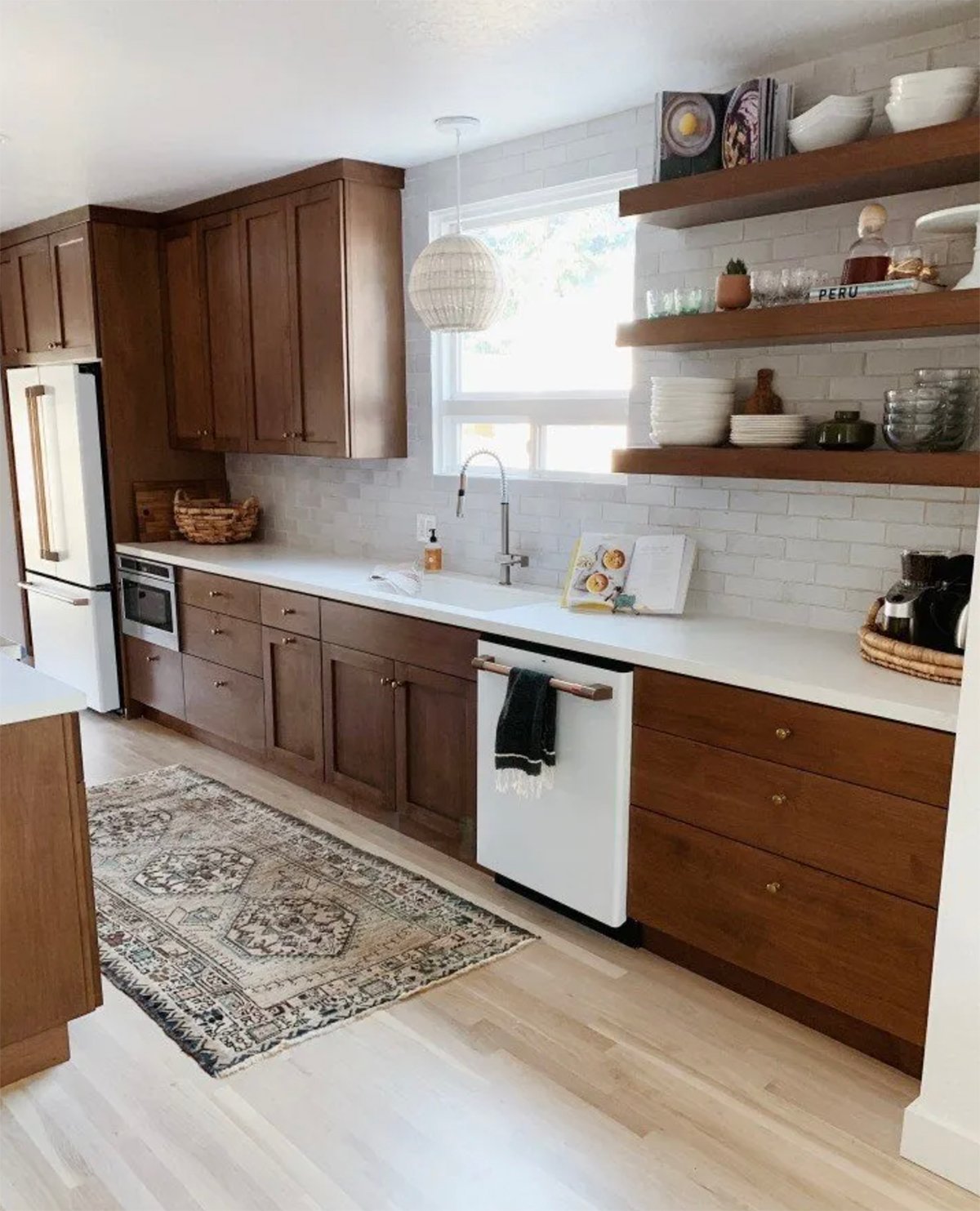
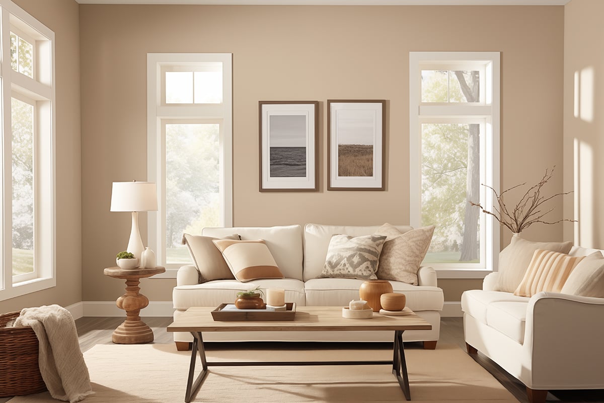
Repose Gray in Kitchens
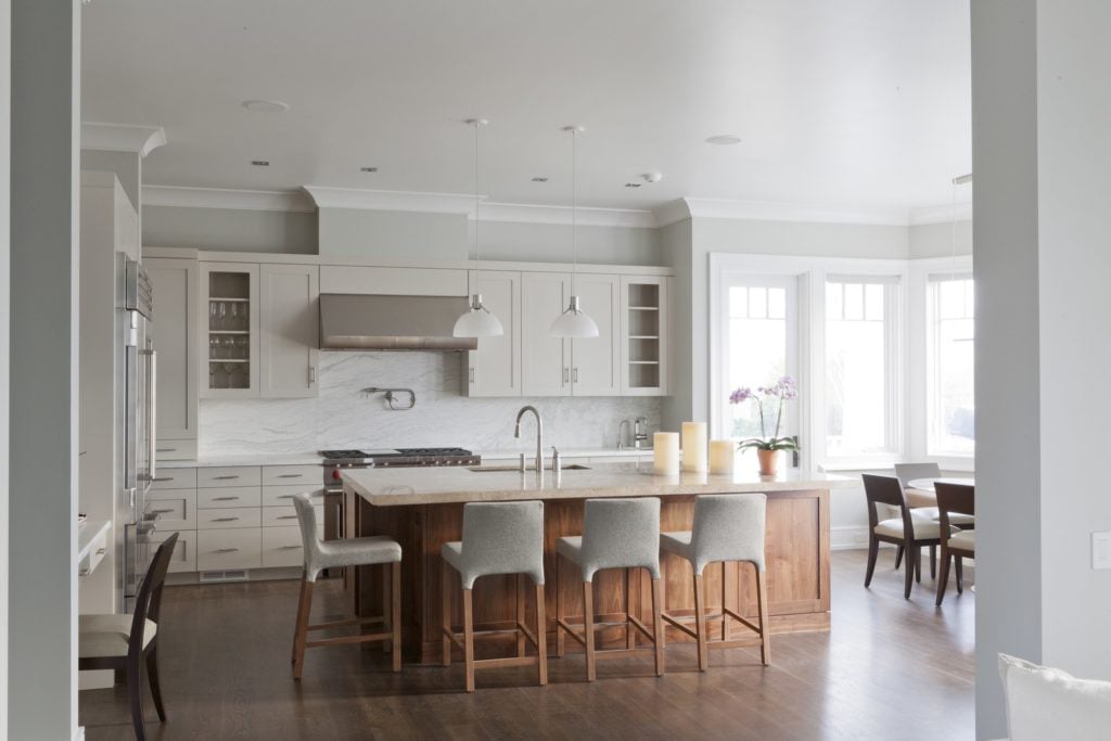
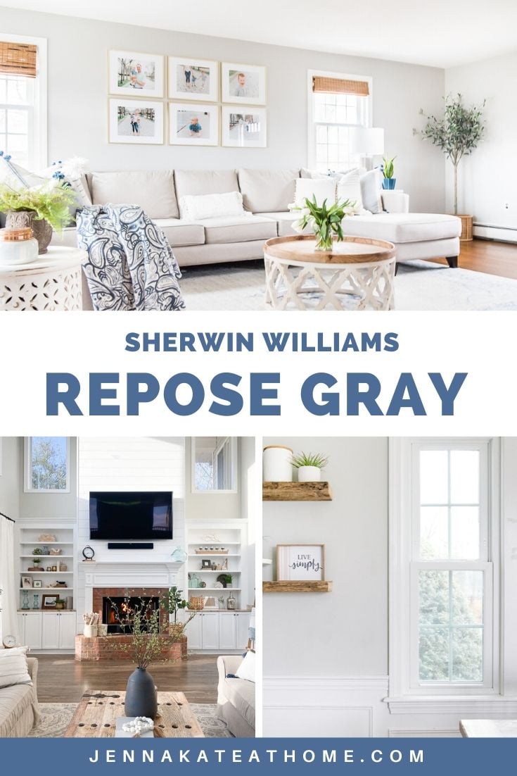
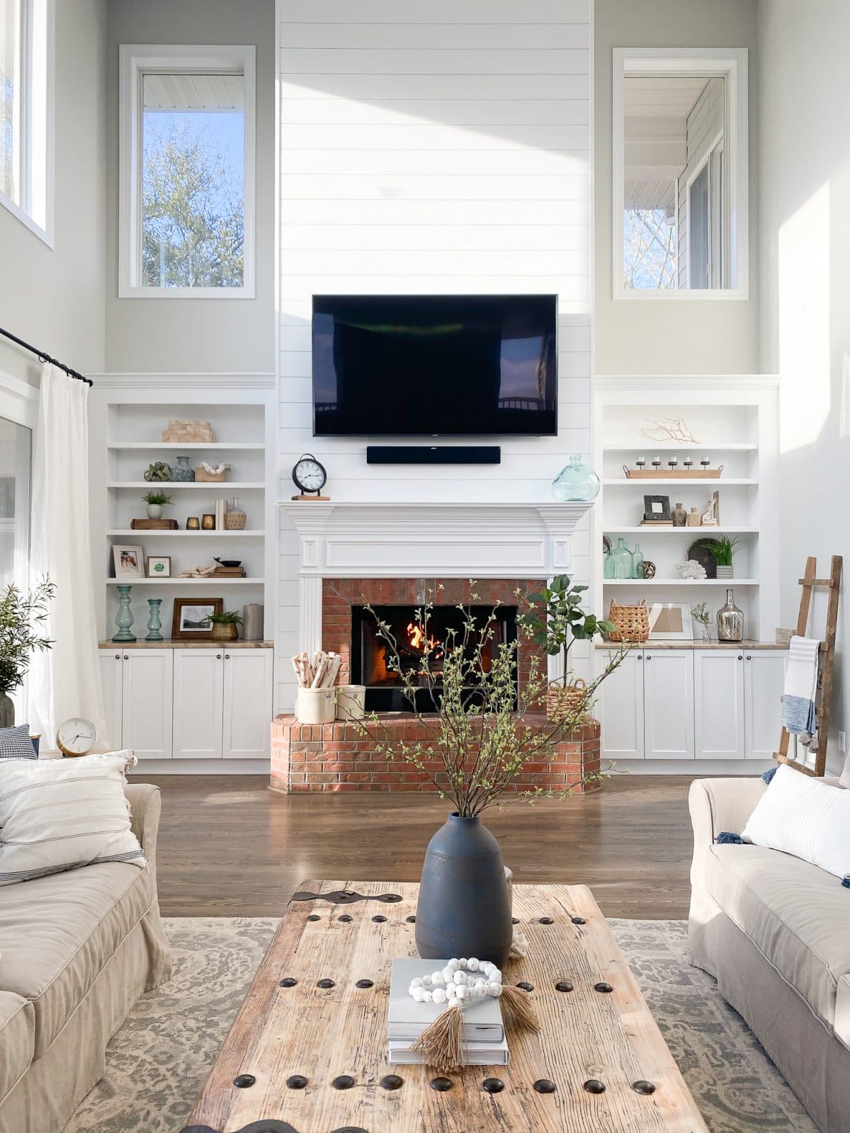
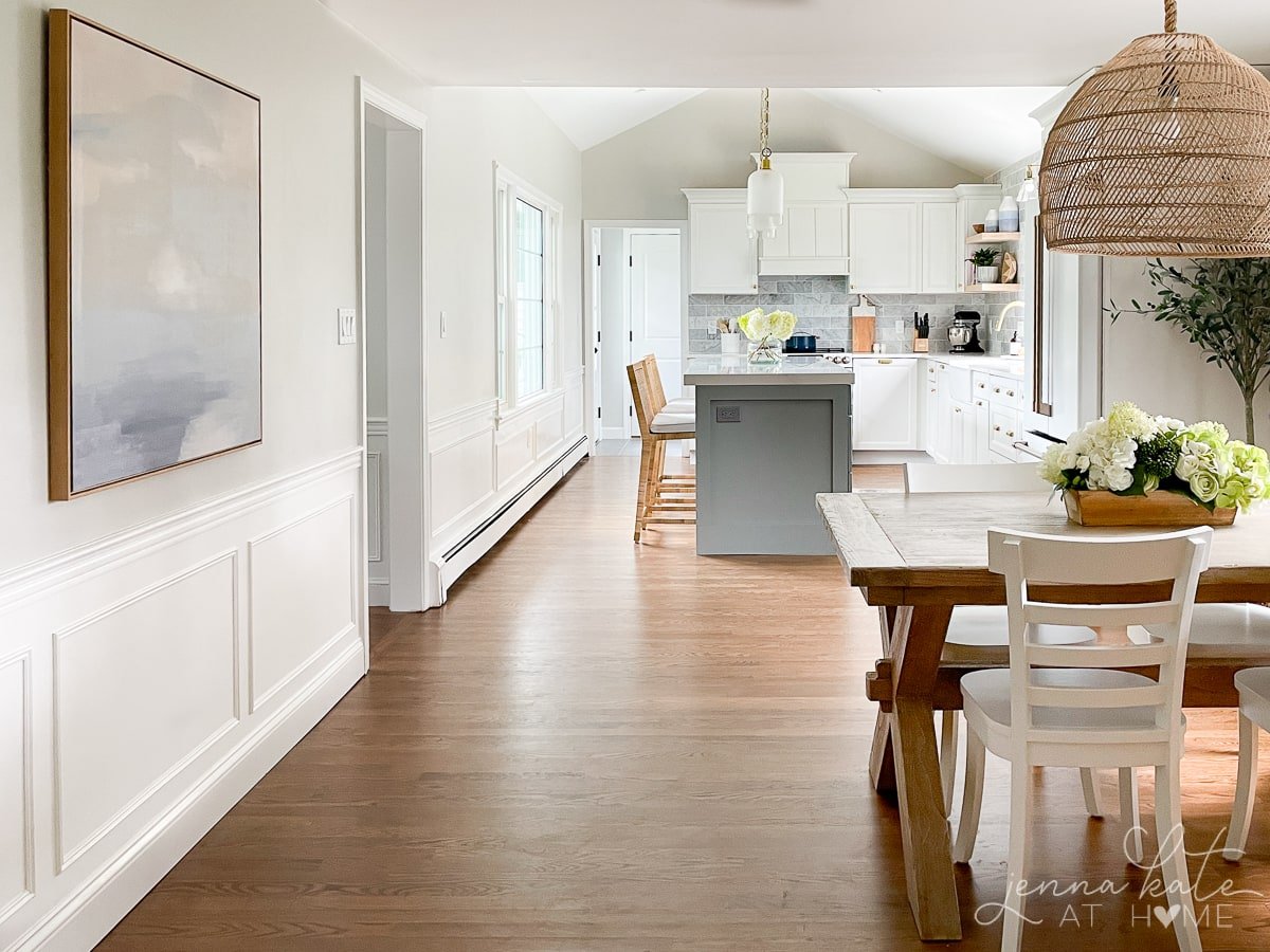
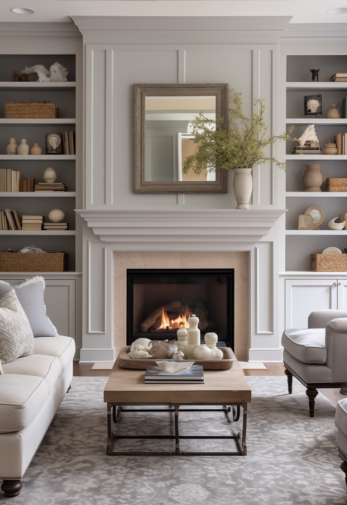
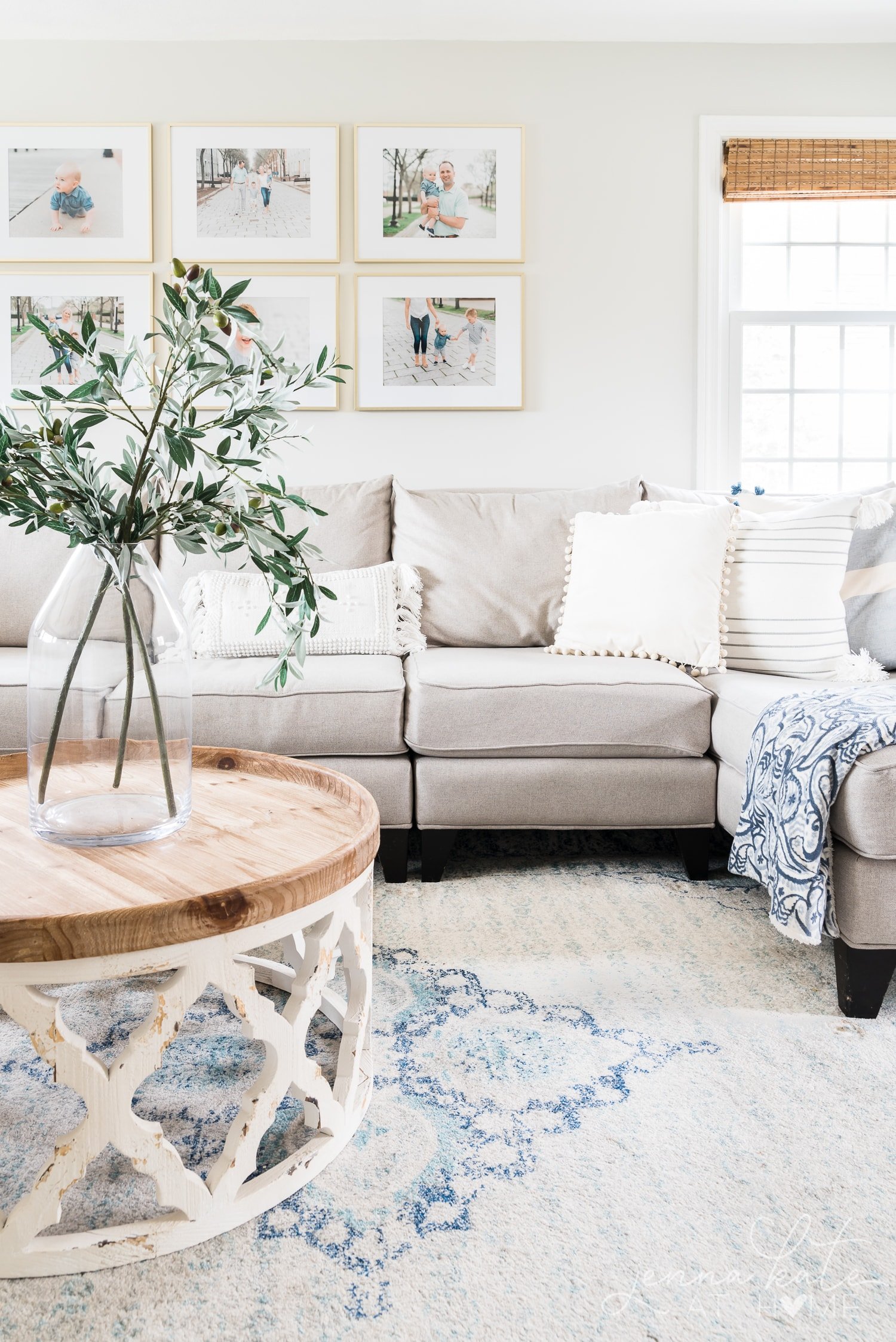
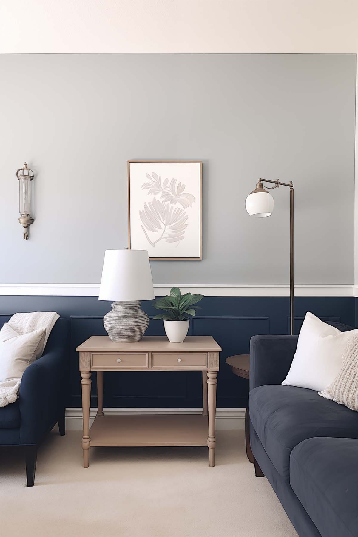
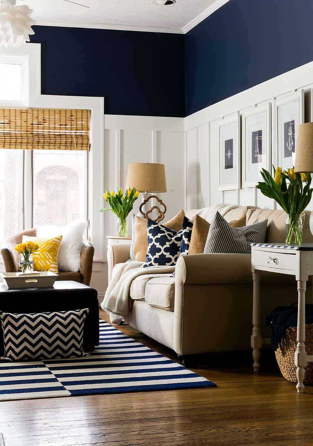
Repose Gray in Living Rooms
In the example above, you can see how the natural light greatly affects the color. On the right hand side, Repose Gray is considerably lighter than how it looks on the left hand side. The amount of light your room receives will really impact how this color looks.

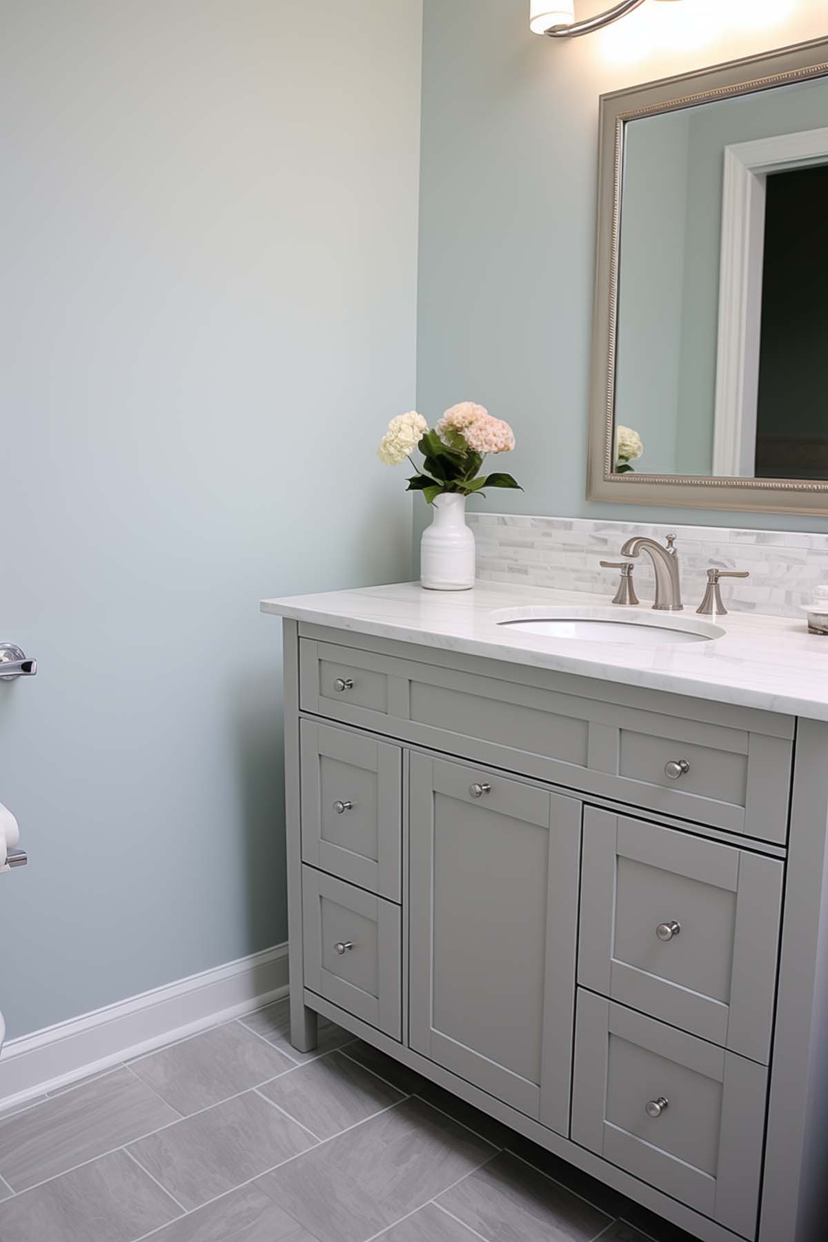
Repose Gray in Bathrooms
Repose Gray never feels cold and works well with so many colors and finishes. It really is such a great paint color for any room in your home, bathrooms included!


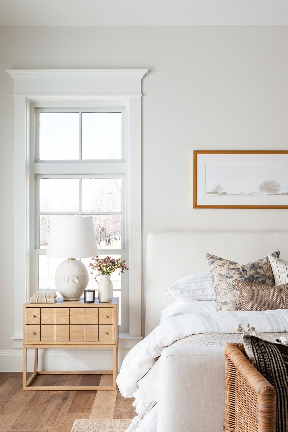
Repose Gray in Bedrooms
White trim, bright light and light colored furnishings definitely help favor the cooler side of this paint color. So if you want it to lean towards gray more than its warmer side, keep that in mind.


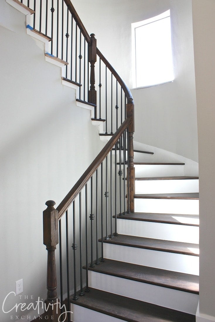
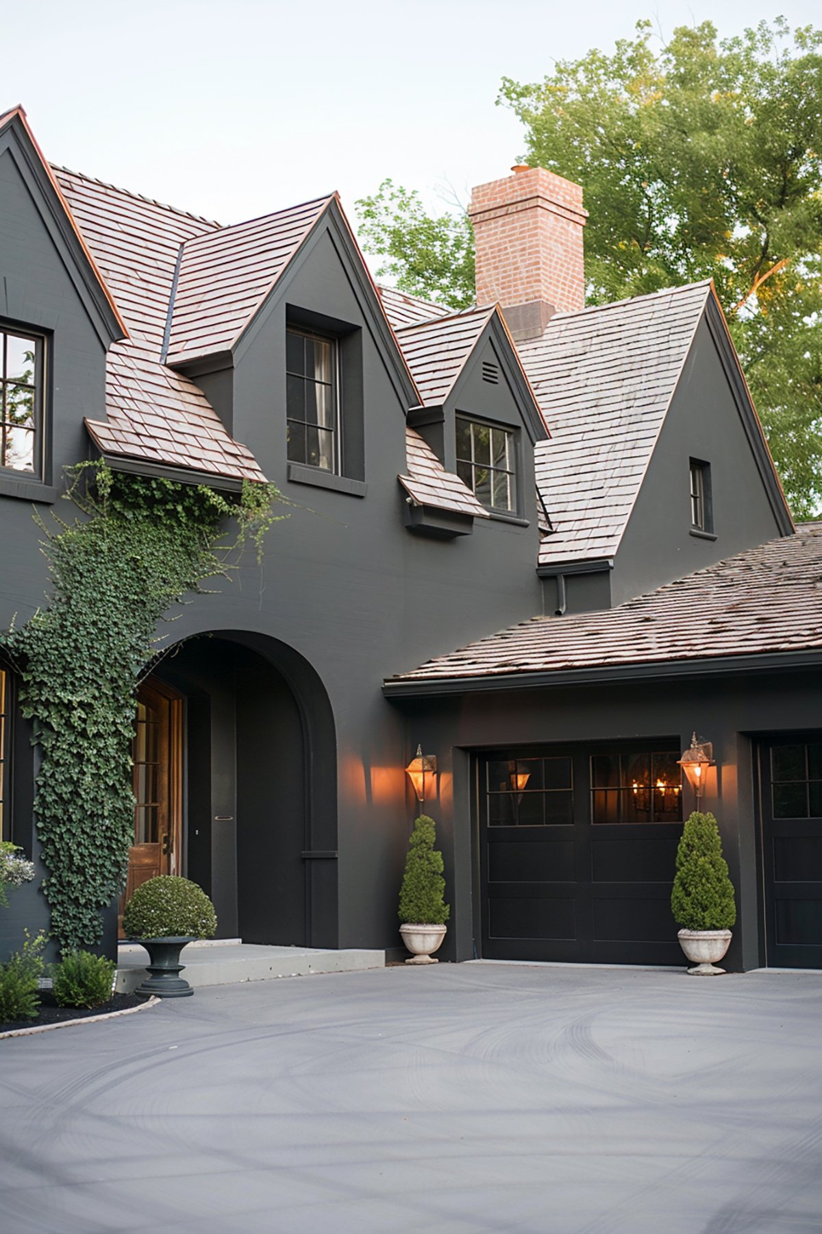
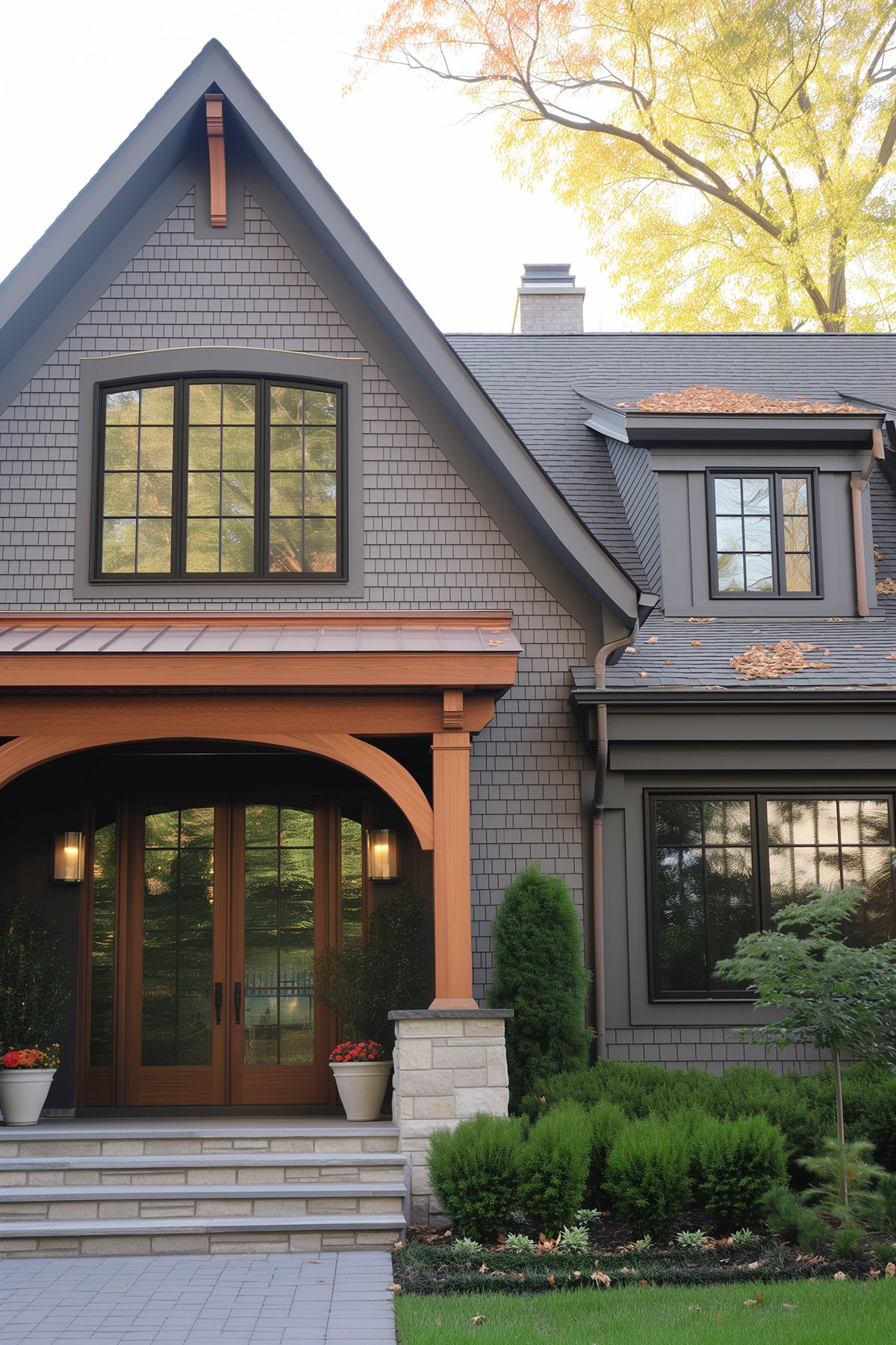
Repose Gray in Entryways and Mudrooms
In the following photos, you can see how well Repose Gray works when paired with warm woods. A lot of warmer grays will start to look muddy or too beige when paired with darker woods, but this one still maintains its gray color.


What Paint Color is Similar to Repose Gray?
There’s no exact match across brands. Benjamin Moore Collingwood Gray is similar, but lighter. London Fog is also another similar color, but darker.
If you love the look of Repose Gray lightened by 50%, then Sherwin Williams Incredible White is a close match. Its undertones are different – leaning pink/beige instead of green/beige, but you’ll get a very similar color depth.
Complementary Colors and Combinations
SW Repose Gray pairs well with a variety of colors, creating harmonious and aesthetically pleasing combinations. Here are five complimentary colors and color combinations for Repose Gray:
1. SW Naval (SW 6244)
Naval is a deep, rich navy blue that complements Repose Gray by offering a bold contrast. This combination is ideal for creating a balanced look with a mix of neutral and strong, confident color.
If you’re looking to do an accent wall, Naval would be a great choice with the other three walls being Repose Gray.
2. SW Alabaster (SW 7008)
Alabaster is a soft, warm white paint color that pairs beautifully with Repose Gray. This combination creates a subtle, serene color palette, perfect for living rooms and bedrooms where a calming atmosphere is desired.
3. SW Sea Salt (SW 6204)
Sea Salt is light, airy green with gray undertones. Sea Salt complements Repose Gray by adding a touch of natural, earthy tones. This pair is great for creating a soothing, spa inspired color scheme.
4. SW Agreeable Gray (SW 7029)
Agreeable Gray is a lighter, warmer gray that harmonizes well with Repose Gray. Together, they offer a monochromatic scheme that’s both modern and cohesive, suitable for contemporary spaces.
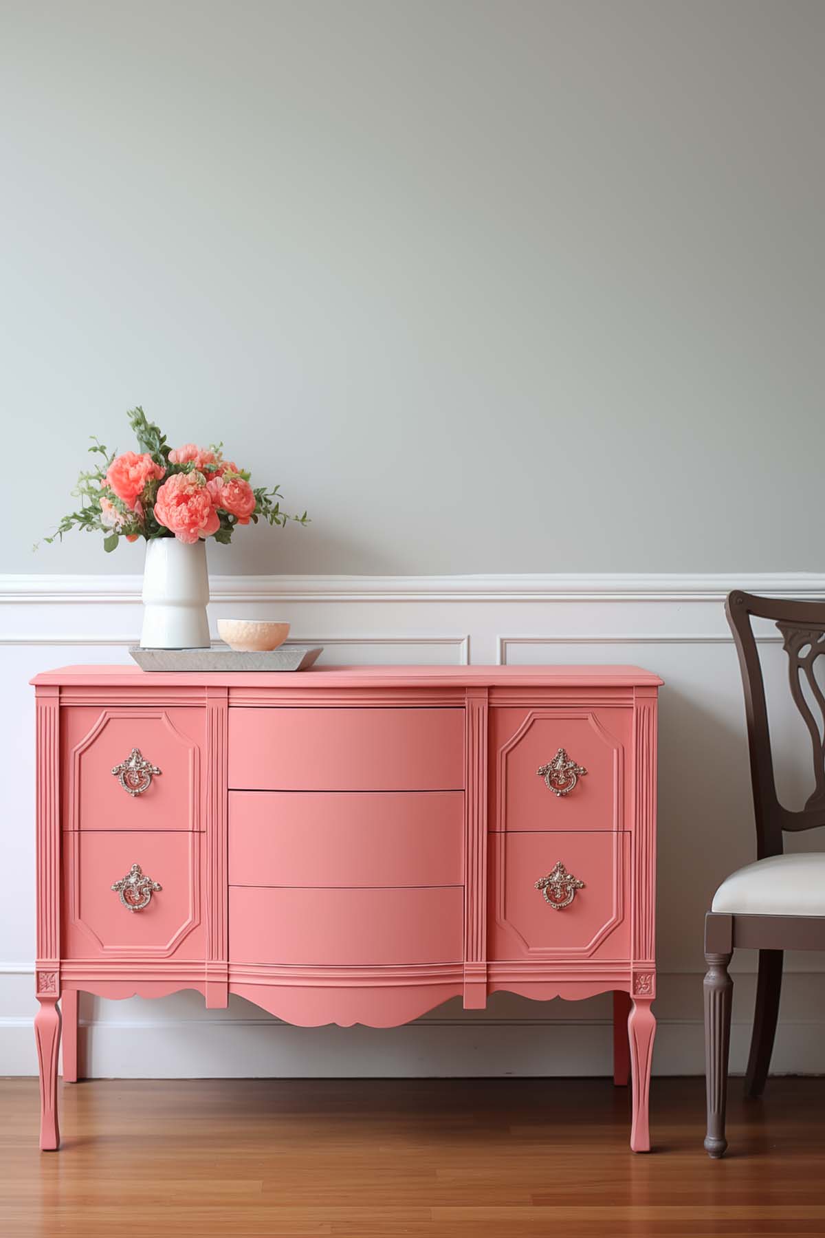
5. SW Coral Rose (SW 9004)
A vibrant coral that provides a striking contrast to Repose Gray. This combination is perfect for adding a pop of color and warmth to a room, making it lively and inviting.
Frequently Asked Questions
Don’t Forget To Always Use Real Paint Samples!
Don’t forget – no matter what you’ve read or photos you’ve seen online, it’s really important to sample paint colors in your home before committing!
Samplize provides peel and stick paint samples made with real paint, that are easy to move around your home, and cheaper than buying a gazillion paint pots! It’s the only way I buy paint samples.
Is Repose Gray Right For You?
Are you ready to ditch the traditional cold grays of the past, but still love gray? Repose Gray gives you the best of both worlds. Its warm undertone means it works alongside both warm and cool colors, making it a great choice for many rooms.
Repose Gray works best in well-lit spaces and may not have enough warmth to counteract cool-toned northern light. I like it best in sunny rooms.
Love the undertones but find the color just a bit too dark? Lighten Repose Gray by 50% and you’ll have the perfect light and airy color that works anywhere!
Hi, what color is the kitchen island in these photos, it’s a darker grey?
The island under the photo where it’s Repose Gray lightened by 50%? That island is Benjamin Moore Boothbay Gray.
What color is your front door? It’s a gorgeous shade of blue
Hi! It’s BM Britannia Blue
I’ve learned so much from your blog! It’s been a wealth of information and I don’t feel so “alone” trying to decide on paint colors Ü We built, what we thought, was our forever a.k.a. retirement home in another state 2 years ago. Repose Gray was the shining star in our home with tons of light from east and west directions. Even the southern exposure in our primary bedroom was able to make Repose Gray so regal against the SW Extra White semi-gloss trim ♥ Fast forward to our recent 20 year old home purchase. Real wood windows and casings, tall stained baseboards, mature trees flanking most windows…I realized after one north wall painted with my beloved Repose Gray the love affair was over. It was baby boy nursery blue. Even on other walls, it just can’t compete with low light and real wood trim. I am still gutted. Just not enough bright sun to turn it into the beautiful gray I had grown so accustomed to (insert super sad face). Of course, I purchased my standard 5 gallon bucket of it, too Ü
Ugh, I’m so sorry! Light and the environment play such an important role in selecting paint colors. I’ve actually never seen Repose Gray look that blue, but I’ve seen it look a kind of muddy green which is not nice either.
Hello- Love all your posts and ideas. I have Repose Grey throughout my downstairs, lightened 50% upstairs and love it, but feeling like maybe my bedrooms need their own identity. I know you love this color too, have you used, or do you like any particular colors for bedrooms that wont contrast or compete with the Repose in hallway?
Hi Maura! I think bedrooms are a great room to switch up the colors! I think anything the coordinates with Repose Gray (whites, off-whites, blues, grays) will flow well. My bedrooms are mostly SW Pure White (with blue accents) but our master bedroom is really dark so we opted for BM White Dove walls with pure white trim and we love it. Something like SW Shoji White would be really nice too if you want a bit more depth to the color.
Ty! Is Repose @50% too close to Gossamer Veil? Also I have a crisp white trim and gray carpeting in the kids rooms. I read Shoji leans into orange-pink. Not sure if that’s true, but is that ok with a crisp white?
Hi Jenna, As many have said I also love the repose gray lightened by 50%. I am relocating to Nigeria, and they have SW paint….but not the ability to make custom blends…I don’t know why…just what I’m told. Is there a regular SW color that comes close to the repose gray lightened by 50%? Thanks for you help.
Hi Damian! SW Incredible White is similar….it’s less green and a bit more pink, but unless they were side by side you probably wouldn’t notice the difference.
Thank you for the quick response Jenna. If I did a wall in Incredible White” and the trim in Alabaster…..would that look like the walls were lighter than the trim?
Hi there. Loving Repose Gray and unsure of what color white I should go with for the board and batten. In the pic of your entryway- what white did you go with on the bottom? I chose a white and started painting and it seems super bright. Not sure I like the white I chose.
Hi! We have SW Pure White