Content may contain affiliate links. When you shop the links, I receive a small commission at no cost to you. Thank you for supporting my small business.

Blue gray paint colors have become increasingly popular in recent years due to their calming effect and versatility. This color palette provides a sophisticated, elegant touch to any space while still allowing for the calming and relaxing atmosphere that blue hues often provide.
What are Blue Gray Paint Colors?
I know what you’re thinking – what on earth is blue gray paint (or gray blue paint, depending on what you call it!). Blue gray is a color that is a blue with strong gray undertones, or conversely, a color that looks gray on the color swatch but actually has a strong blue undertone.
Whether you want a grayish-blue or a blueish-gray, I’ve got you covered!
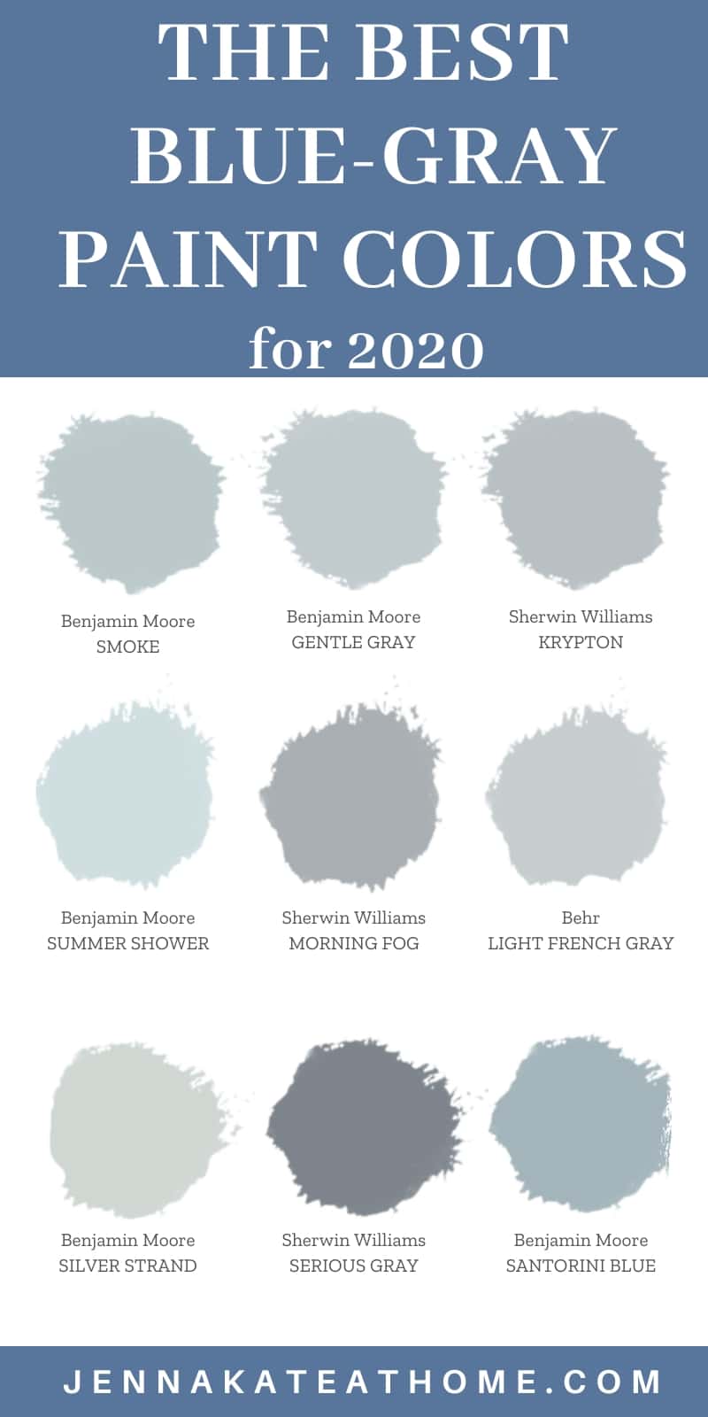
Light Blue Grays from Benjamin Moore
These first eleven shades are my all time favorite light blue grays from Benjamin Moore.
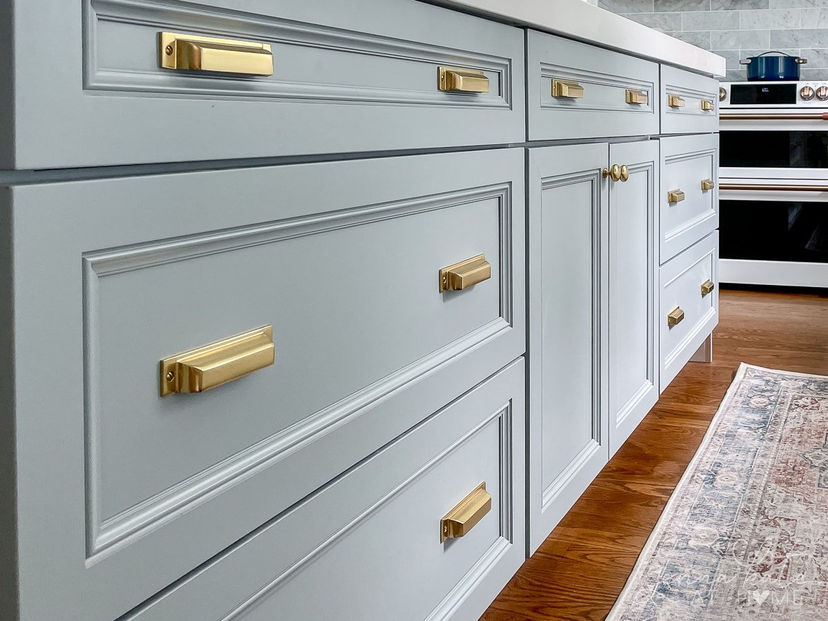
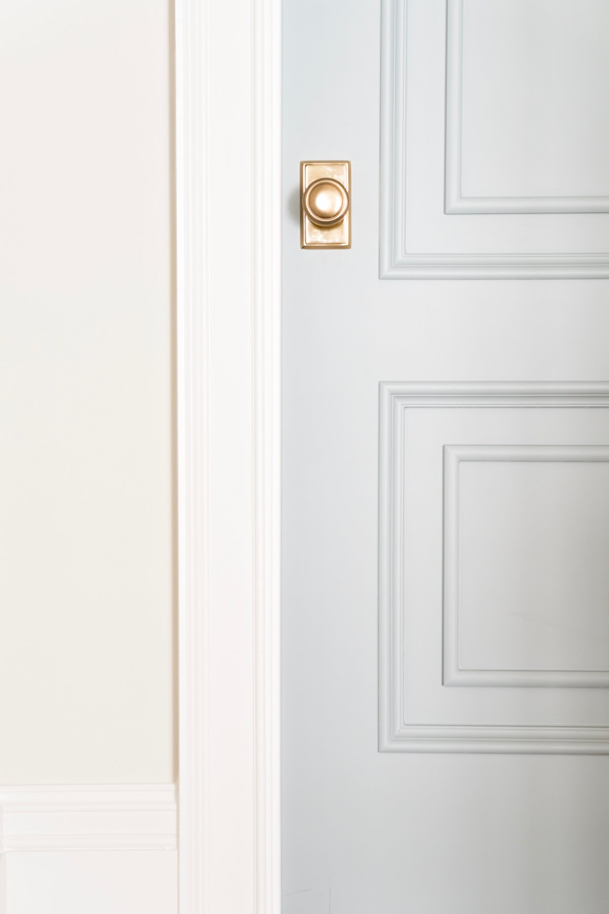
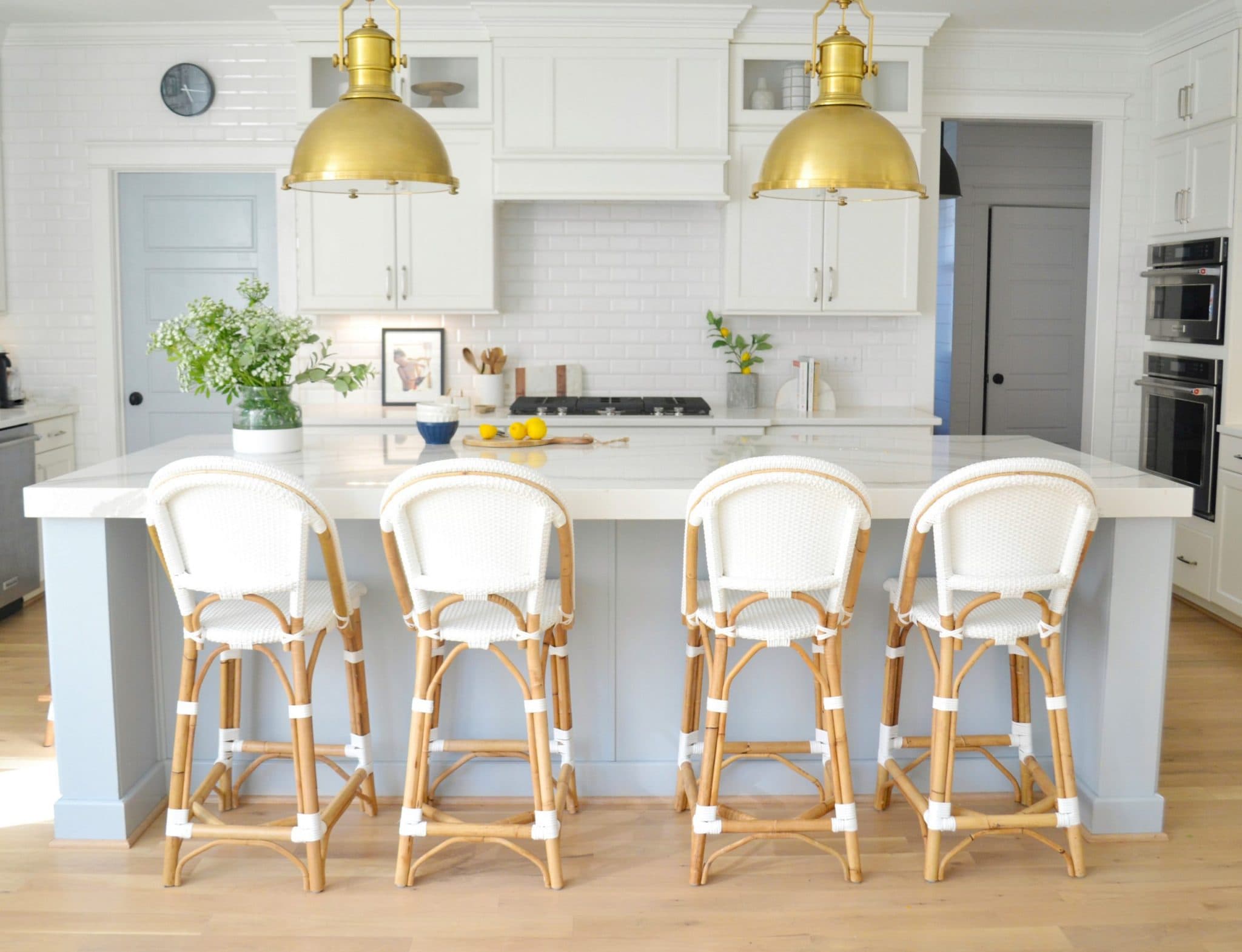
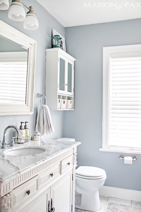
1. Benjamin Moore Boothbay Gray
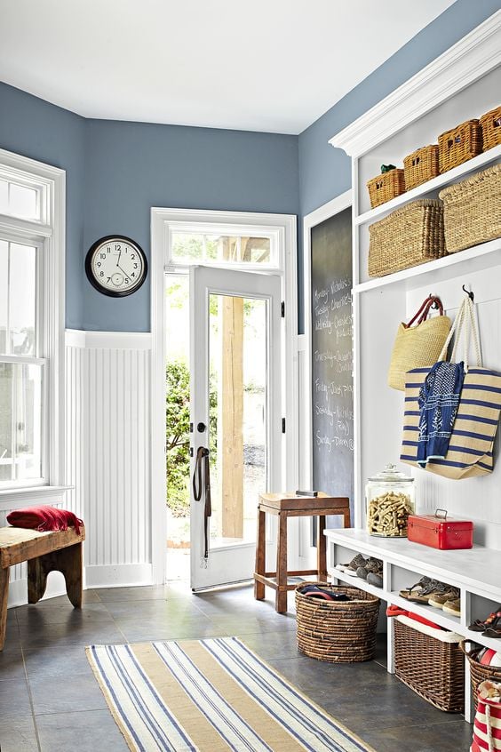
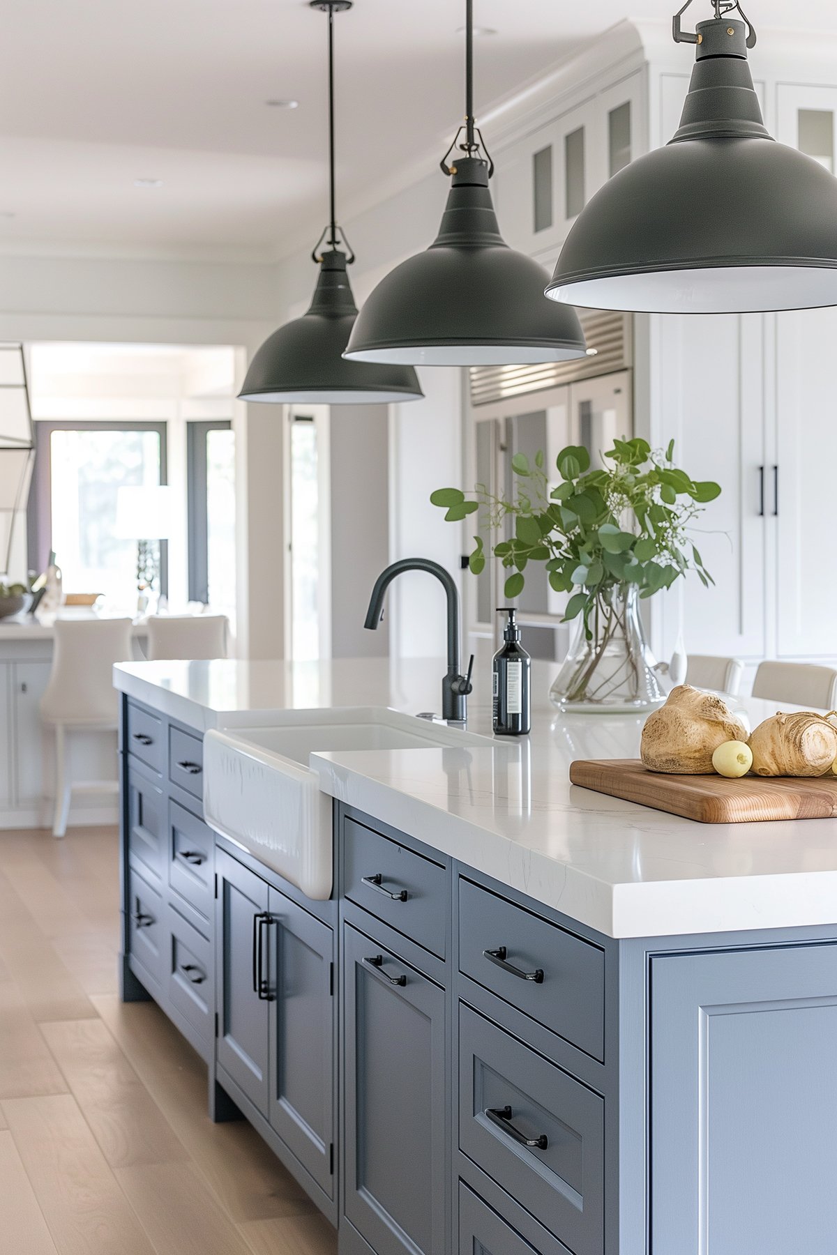
Benjamin Moore Boothbay Gray is a light grey blue paint color. It leans closer to gray but with the softness of blue. It’s very pretty and feminine, and works wonderfully as a door, kitchen island (see it in our kitchen remodel) and as a wall color, too.
I’ve had this particular image (below) pinned to one of my Pinterest boards for several months and it really makes me want to paint all my doors and add brass hardware. It’s so pretty!
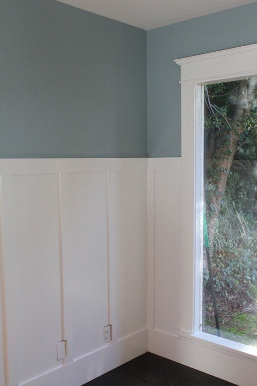
2. Benjamin Moore Santorini Blue
Santorini Blue is a color I’ve loved for years but have yet to use in my own home. It’s one of those colors that looks amazing paired with crisp white wainscoting.
This is a paint color that’s definitely a blue, but with a gray undertone. However, the gray side is more apparent in a room with less sunlight.
It’s a great choice for a blue gray bathroom wall color, but look would also look stunning on a kitchen island or even laundry room cabinets. Personally, I love pairing this one with Silver Satin Benjamin Moore.
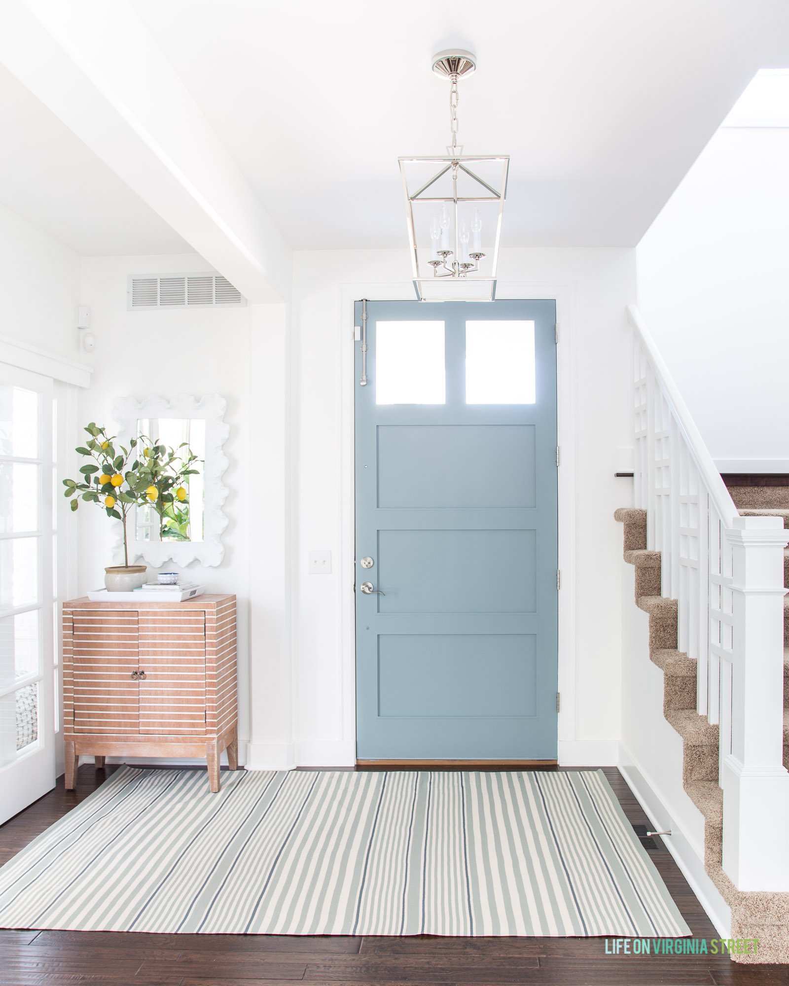
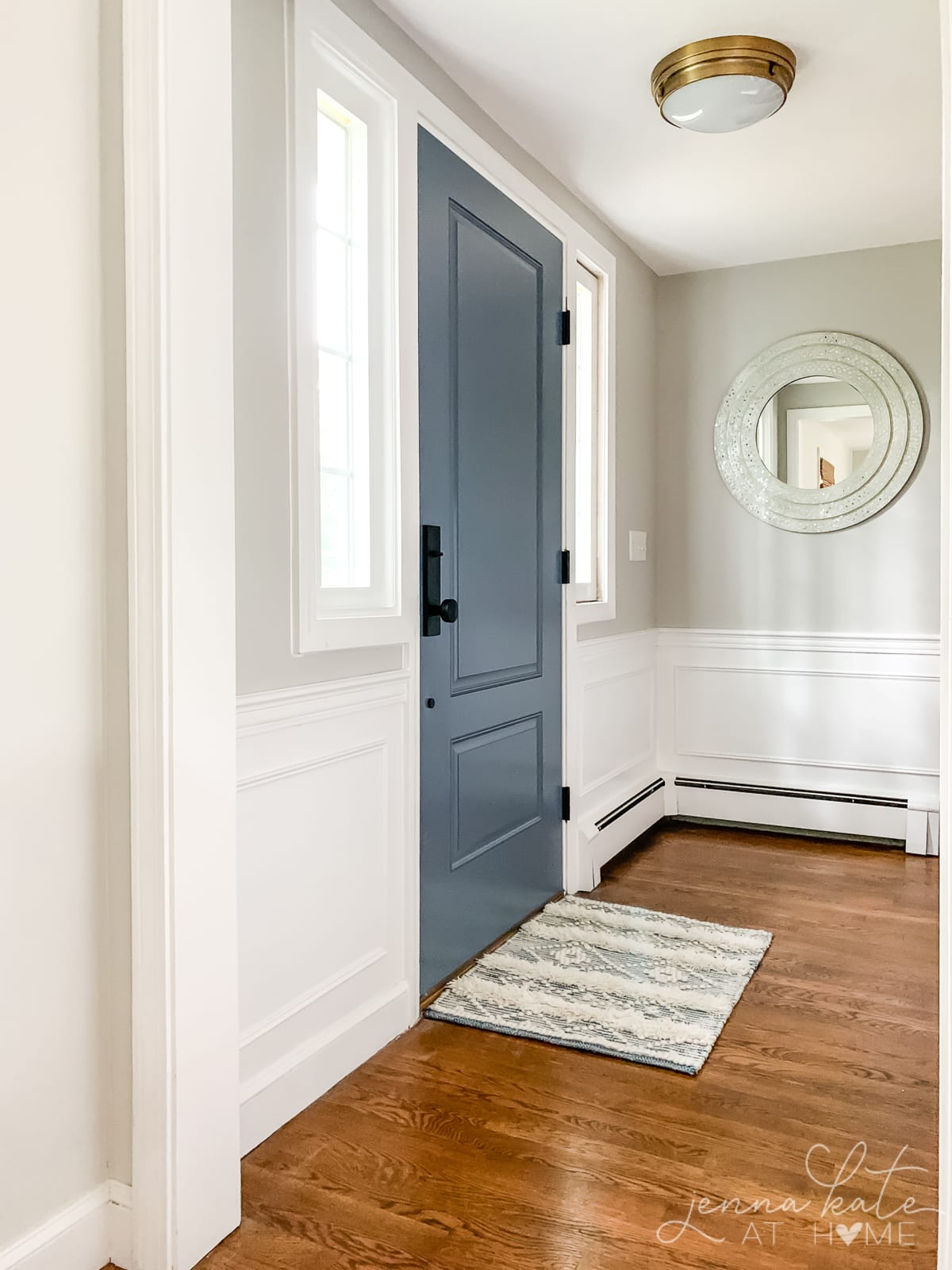
3. Benjamin Moore Water’s Edge
Decidedly more blue with just enough gray to tone it down, Water’s Edge is a fun pop of color in this otherwise neutral entryway.
This is another blue gray color that has a lovely coastal feel, especially when paired with lots of bright white trim.
4. Benjamin Moore Nimbus Gray
Nimbus Gray is one of those colors that completely changes color based on the time of the day and lighting in your home. Sometimes it’s blatantly blue and at other times it’s a moody gray, and yet other times there’s even a wee hint of green. I’m tempted to refer to this one more as a blue-green-gray!
5. Benjamin Moore Summer Shower
The name alone is so pretty, right?
Benjamin Moore’s Summer Shower is a pale, blue-gray paint color that exudes a calming, spa-like feel. It has an LRV (Light Reflectance Value) of 69, which means it reflects a good amount of light and can make a room feel brighter and more spacious.
The undertones of Benjamin Moore Summer Shower are predominantly blue with a subtle gray undertone. It is a cool color that works best in rooms that receive ample natural light, as it can appear darker in dimly lit spaces.
When it comes to pairing with whites, Summer Shower works best with crisp, clean whites that have no yellow or pink undertones, such as Benjamin Moore’s Chantilly Lace or Simply White.
While Summer Shower does not have any sneaky undertones, it is important to note that it can appear more blue or gray depending on the lighting in the room.
Summer Shower works well on both walls and cabinets/doors. It can be used in a variety of spaces, such as bedrooms, bathrooms, and living areas, to create a calming and relaxing atmosphere.
To bring out the full beauty of this color, it is best to use it in rooms that receive plenty of natural light, particularly those facing south or west. In rooms that receive less natural light or face north or east, it may appear cooler and darker.
6. Benjamin Moore Smoke
Benjamin Moore Smoke (LRV 56.06) – a blue-gray that creates a serene and calming environment.
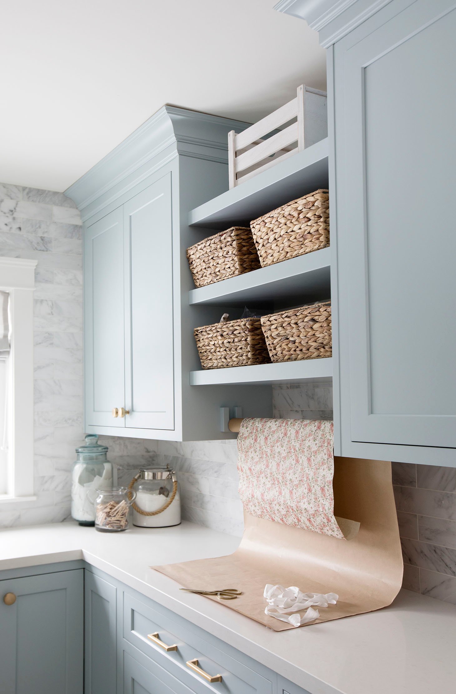
These Smoke painted cabinets are another image that I’ve been drawn to for a while now. When I saw this laundry room reveal from Jillian Harris, I immediately wanted to paint my kitchen cabinets the same color.
I ended up choosing Boothbay Gray instead, but I definitely want to use this one at some point.
7. Benjamin Moore Gentle Gray
Benjamin Moore Gentle Gray is a pale blue-gray with gray undertones that creates a calming, coastal atmosphere.

Proof that blue-gray colors are not just for bedrooms and bathrooms. To truly create a soft, casual coastal feel in your home, flow a soft blue-gray like Benjamin Moore’s Gentle Gray throughout the main floor.
8. Benjamin Moore Gray Wisp
Benjamin Moore Gray Wisp is another one of those blue-green-gray colors! I love these colors because green undertones work really well with warmer wood tones, and stop the blue-gray part from feeling cold.

9. Benjamin Moore Arctic Gray
Is it gray? Is it blue? Is it green? Are you seeing a trend with these chameleon colors? Arctic Gray does actually lean a bit green/blue.
Pay attention to the top of the wall which is getting a lot of natural light and compare it to the bottom where it’s pulling more bue/green. These undertones make it stunning in a bathroom, don’t you think?

10. Benjamin Moore Quiet Moments
Benjamin Moore Quiet Moments is a mix of blue, green, and gray that adds a serene and calming touch to any space.
The undertones of Quiet Moments are a mix of blue and green, with gray undertones that create a serene and peaceful atmosphere. This color pairs well with warm whites, such as Benjamin Moore’s Simply White or White Dove, which help to balance the coolness of the blue-green undertones.
Quiet Moments does not have any sneaky undertones. However, it is worth noting that paint colors can appear slightly different depending on the lighting conditions and surrounding colors in a room.
11. Benjamin Moore November Skies
Benjamin Moore November Skies is a blue-gray that shifts in color depending on the lighting, giving it a unique, ethereal quality.
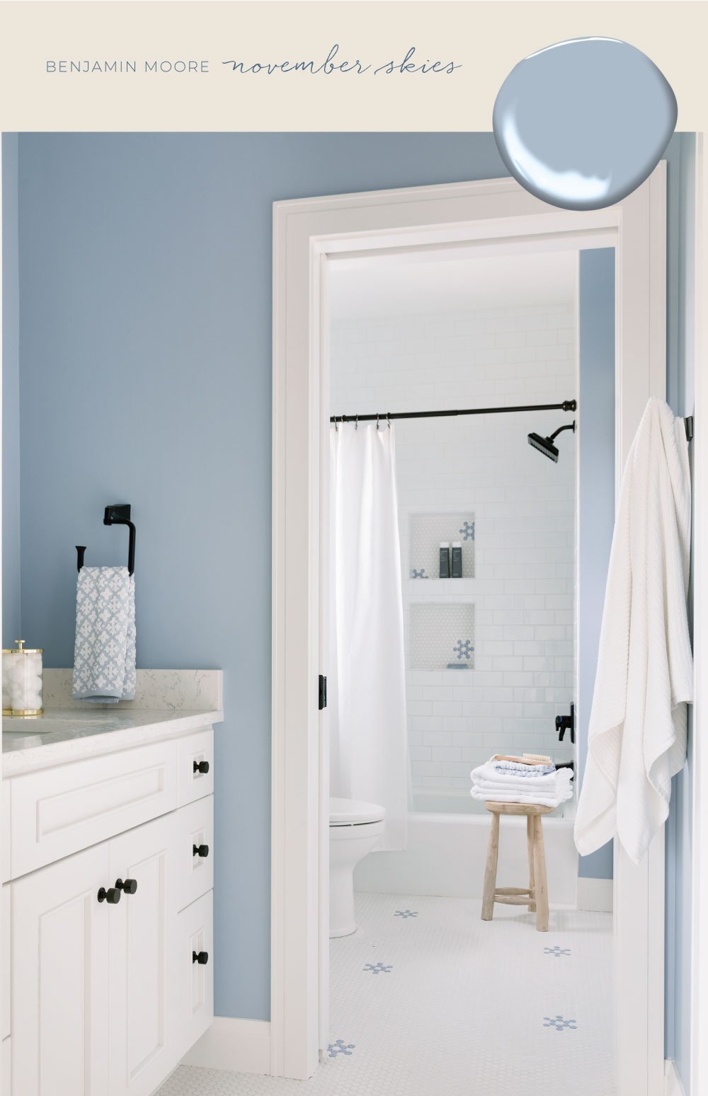
The color is a balanced blend of gray and blue, but some people might perceive it more as a blue hue, depending on the lighting conditions and the other colors in the room. There is a slight undertone, which may become apparent as a result of the fixtures in the surrounding room.
November Skies pairs well with crisp whites such as Chantilly Lace or softer whites like Sherwin Williams Pure White.
The color can work well in different room exposures, but it may look best in rooms with natural light or in spaces that receive a lot of light throughout the day.
November Skies is suitable for both walls and cabinets/doors. It can create a calming, serene atmosphere when used on walls, and a refreshing touch when applied to cabinetry or doors.
Overall, Benjamin Moore November Skies is a sophisticated and versatile color that can add a soothing touch to any room.
Light Blue Grays from Sherwin Williams
The next seven shades are my all time favorite light blue grays from Sherwin Williams.
12. Sherwin Williams Tradewind
Sherwin Williams Tradewind is a soft blue-gray with hints of green undertones that pairs well with off-white and beige.
Sherwin Williams Tradewind is a light to medium blue-green paint color with a calming and refreshing feel. Its LRV (Light Reflectance Value) is 61, which means it reflects a moderate amount of light and can make a space feel bright without being overly reflective.
The undertones of Tradewind are predominantly blue with a subtle greenish-gray undertone. It is a versatile color that can work well in different spaces, from bedrooms and bathrooms to living rooms and kitchens. It pairs nicely with neutral colors such as whites and grays, as well as natural materials like wood and stone.
When it comes to pairing with whites, Sherwin Williams Tradewind works well with warm whites, such as Alabaster and Creamy, as well as cooler whites like High Reflective White and Extra White.
13. Sherwin Williams North Star
Sherwin Williams North Star is a beautiful blue-gray paint color with a cool undertone that creates a peaceful and calming atmosphere in any space. With an LRV (light reflectance value) of 61.4, it’s a mid-tone color that offers just the right amount of contrast while still remaining subtle.
The undertones of North Star are a blend of blue and gray, which gives it a timeless and versatile look that complements a variety of decor styles.
It works well in bedrooms, bathrooms, and living rooms, especially when paired with crisp white trim or warm wood accents. North Star can also be used as an exterior paint color for a classic and inviting curb appeal.
14. Sherwin Williams Misty
Sherwin Williams Misty paint color is a beautiful, light, and airy shade of blue-gray. With an LRV (Light Reflectance Value) of 68, it is considered a light-toned color that reflects a decent amount of light.
Misty has subtle undertones of green, which can make it appear slightly cooler in some lighting situations.
This color works well in a variety of spaces, including bedrooms, bathrooms, and kitchens. It can be paired with white or other neutrals for a calming, serene feel or with brighter colors for a more energetic look.
Overall, Misty is a versatile and sophisticated paint color choice that can create a soothing and tranquil ambiance in any room.
15. Sherwin Williams Krypton
One of my new favorite colors, Sherwin Williams Krypton is a light gray with a light blue undertone. Depending on who you ask, they will say it’s either gray or baby blue.
How it looks in your home will depend upon the exposure of your room and how much natural light it gets.
I love how Chrissy Marie painted both her island and pantry door this soft shade. It works so well with the bright white cabinets (SW Extra White) and brass accents, for the perfect cool, coastal vibe.
16. Sherwin Williams Morning Fog
Sherwin Williams Morning Fog is a shade lighter on the color card than Serious Gray. I chose it for the inside of our mudroom and garage doors. It’s a beautiful color and I love how it adds color to our otherwise white kitchen.
Unfortunately, it can have a slight purple/lavender undertone at certain times of the day.
If you’re looking for a gray-blue that sticks to those two colors and doesn’t skew into purple, it might be best to avoid it.
17. Sherwin Williams Silver Strand
Sherwin Williams Silver Strand is a soft, muted gray-blue color that is part of the neutral paint color family. It has an LRV (Light Reflectance Value) of 59, which means it is a relatively light color that reflects a good amount of light.
The undertones of Silver Strand are predominantly cool blue-gray, but there are also hints of green and purple undertones, which can give it a subtle chameleon-like quality, depending on the lighting in the room.
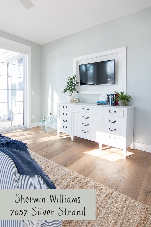
Silver Strand works well in a variety of spaces, including living rooms, bedrooms, bathrooms, and kitchens. It pairs best with bright whites or creamy whites to create a crisp contrast that makes the color pop.
Some of the popular white paint color options that pair well with Silver Strand are Sherwin Williams Alabaster, Pure White, and Extra White.
While Silver Strand may appear like a straightforward gray-blue, it does have some sneaky undertones. As mentioned before, depending on the lighting in the room, the color can appear to have a subtle green or purple undertone.
Therefore, it is important to test the color in your specific space to see how it interacts with your lighting and decor.
Silver Strand is versatile enough to work on both walls and cabinetry. For walls, it creates a calming, soothing atmosphere, and on cabinets or doors, it adds a subtle touch of color without being overpowering.
Silver Strand is a great choice when you want to keep things fairly neutral on your walls. It’s a beautiful light gray with a blue undertone that really pops against white and lots of greenery.
It feels very clean and fresh, especially when used in a room with a lot of natural light.
18. Sherwin Williams Upward
Sherwin Williams Upward is the Sherwin Williams 2024 Color of the Year. It is definitely a blue with a gray undertone. It’s slightly lighter in color than Krypton and bluer.
I think it’s a great choice for a bathroom, baby nursery or bedroom.
Light Blue Grays from Behr
The next two shades are my all time favorite light blue grays from Behr.
19. Behr Light French Gray
Behr’s Light French Gray (not to be confused with the Sherwin Williams color of the same name) is another beautiful blue-gray color.
I originally chose it for our master bedroom when we moved into our house several years ago, but had to switch it out for a less “blue” color as it made our north-west facing room feel very cold.
I definitely recommend using it in a room that gets warmer light to stop it feeling overly blue and cold.
20. Behr Reflecting Pool
Behr Reflecting Pool is a blue gray shade from Behr that’s a popular paint color. We’ve used it several times, in both homes that we’ve owned.
When I hear light blue gray paint, this one immediately springs to mind. It’s a very light color that definitely looks pale gray in some lights and almost baby blue in other light.
It’s very soft and calm, perfect for a bathroom or nursery. We even used it in our basement and kids’ playroom.
Reflecting Pool is actually one shade lighter than Behr’s Light French Gray which was directly mentioned above.
Dark Blue Grays from Benjamin Moore
The next four shades are my all time favorite dark blue grays from Benjamin Moore.
21. Benjamin Moore Brewster Gray
Benjamin Moore Brewster Gray HC-162 is a paint color offered by Benjamin Moore. It is a medium to dark gray with a warm undertone. Its LRV (Light Reflectance Value) is 29.9, which means it is a relatively dark color and may absorb more light in a space.
The undertones of Brewster Gray are primarily blue and gray with a slight hint of green, giving it a natural and earthy feel.
It pairs well with warm whites such as Benjamin Moore’s White Dove or Simply White. It can also work with cooler whites such as Benjamin Moore’s Chantilly Lace or Decorator’s White.
There are no sneaky undertones that may not be obvious with Brewster Gray, as its undertones are quite apparent. It works well on both walls and cabinets/doors, depending on the desired look. On walls, it can create a cozy and inviting atmosphere, while on cabinets/doors, it can add depth and richness.
Brewster Gray works best in rooms with ample natural light, as its warm undertones can appear too dark in spaces with limited light. However, it can work in any room as long as it is paired with the right lighting and decor. It is particularly well-suited for spaces such as living rooms, bedrooms, and home offices, where a cozy and inviting atmosphere is desired.
22. Benjamin Moore Britannia Blue
Benjamin Moore Britannia Blue is a beautiful shade of blue with a strong grey undertone.
Britannia Blue can work well on walls, particularly if the room has plenty of natural light. However, it may be best suited for use on cabinets or doors, where it can add a pop of color without overwhelming the space.
When considering using Britannia Blue on walls, it’s essential to take into account the size of the room, the amount of natural light, and the overall design style to ensure it will work well in your space.
When it comes to pairing Britannia Blue with white, it looks best with cool whites such as Benjamin Moore Chantilly Lace or Decorator’s White, or SW Pure White which is a nice soft white. The cooler shades of white create a beautiful contrast with the blue, allowing it to stand out without overwhelming the space.
23. Benjamin Moore Providence Blue
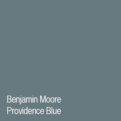
Benjamin Moore Providence Blue is a cool-toned slate blue with dark gray undertones. Despite the distinct green tone to the swatch, I’ve only ever seen it look decidedly blue in person.
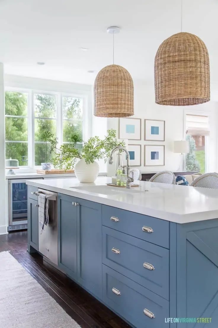
24. Benjamin Moore Gentleman’s Gray
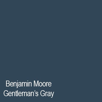
Benjamin Moore Gentleman’s Gray is a stunning navy blue with a slate gray undertone. It looks perfect for an accent wall, exterior siding or a pop of color on a kitchen island or front door.
Dark Blue Grays from Sherwin Williams
The next five shades are my all time favorite dark blue grays from Sherwin Williams.
25. Sherwin Williams Serious Gray
Sherwin Williams Serious Gray is one of my all-time favorite chameleon colors. I would classify it as a dark gray-blue paint color, but sometimes it looks completely gray and only in brighter light you may notice the blue. That’s why I love it so much!
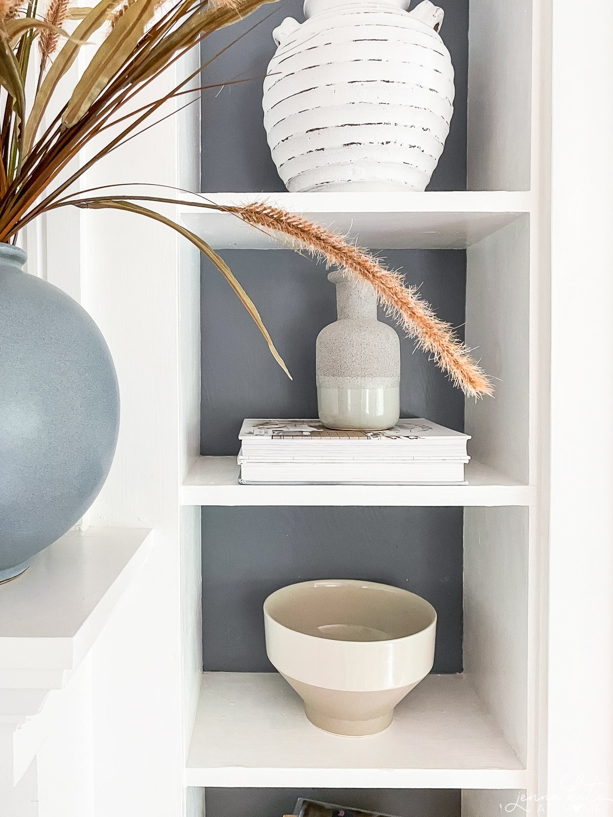
I adore how it changes depending on the time of day and space that it’s in. I’ve used it in multiple spaces in my home, from the inside of my front door, to my bathroom and even the backs of my living room built-ins. It’s also a really good accent color for repose gray, my go-to wall color in our house.
It’s moody and dramatic and so pretty!
26. Sherwin Williams Granite Peak
Sherwin Williams Granite Peak is a beautiful choice that I would recommend for adding a dramatic flair to specific elements in a home, like a kitchen island, a painted dresser, or even a front door.
Its Light Reflectance Value (LRV) of 17 tells you it’s a darker shade, perfect for making a bold statement. I appreciate its deep, smoky blue-gray tone, which brings a sophisticated yet tranquil ambiance to any space.
This color’s beauty lies in its balance – the serene blue mixed with grounded gray undertones creates a versatile hue. In bright spaces, the blue becomes more pronounced, adding vibrancy, while in dimmer settings, it shifts to a subtler, more muted gray.
I find Granite Peak particularly appealing for its ability to fit into various styles, from the sleekness of modern decor to the warmth of traditional settings.
27. Sherwin Williams Bracing Blue
Sherwin Williams Bracing Blue is a bold, denim blue with a gray undertone that adds a sense of drama and sophistication to any space.
Sherwin Williams Bracing Blue is a beautiful and versatile paint color that works well in a variety of spaces. This color has an LRV (Light Reflectance Value) of 24.8, which means it’s a darker color.
Bracing Blue is perfect for bedrooms, bathrooms, and living rooms, where you want to create a serene and tranquil environment. It also pairs well with natural wood accents and crisp white trim, making it a great choice for coastal or modern farmhouse styles.
Bracing Blue is an excellent choice for cabinetry or front doors where you want a pop of color, and also makes for a stunning exterior color.
28. Sherwin Williams Online
Sherwin Williams Online is an adaptable paint color that can enhance many different areas. This color has an LRV (Light Reflectance Value) of 45, indicating it’s a medium shade.
Online is ideal for home offices, kitchens, and bathrooms, where you aim to establish a contemporary and inviting atmosphere. It pairs exceptionally well with sleek metallic finishes and warm wood tones, making it suitable for industrial or modern interior designs.
Online is a superb choice for accent walls or kitchen islands where a subtle yet distinctive color is desired. It also works beautifully as an exterior color, particularly when accented with stone or brick elements.
29. Sherwin Williams Daphne
Sherwin Williams Daphne, with its LRV of 32, is a moderately deep color. This blue shade, enriched with gray undertones, strikes a balance between being bold and subtly sophisticated. It’s not as dark as navy blues but deeper than lighter, airy blues, making it a versatile choice for various spaces.
Given its LRV and color characteristics, Daphne is particularly well-suited for living rooms, bedrooms, or even home offices where a balance of tranquility and character is desired. However, I think it really shines when used as a cabinet color.
In well-lit spaces, the blue aspects of Daphne become more pronounced, creating a vibrant yet calming ambiance. In lower light, the gray undertones emerge, lending a more muted, cozy feel.
Daphne pairs well with a range of complementary colors. Light neutrals, such as off-whites or light grays, can create a soft contrast, while pairing it with warmer tones like taupe or beige can add a sophisticated touch. This color can also work beautifully on kitchen cabinets or as an accent wall, providing a splash of color that is deep and engaging without being overpowering.
For exterior use, Daphne can be an excellent choice for doors or shutters, especially when contrasted with lighter siding, to add a touch of elegance and curb appeal.
Why Are These Grayish Blue Paint Colors So Popular?
Blue grey paint colors are fresh, modern and work with any design style. They look sophisticated and stylish in any home. They are popular because they work with any style of home decor.
I have personally always gravitated towards these colors because I find them so versatile. They complement warmer colors and work harmoniously alongside cooler colors.
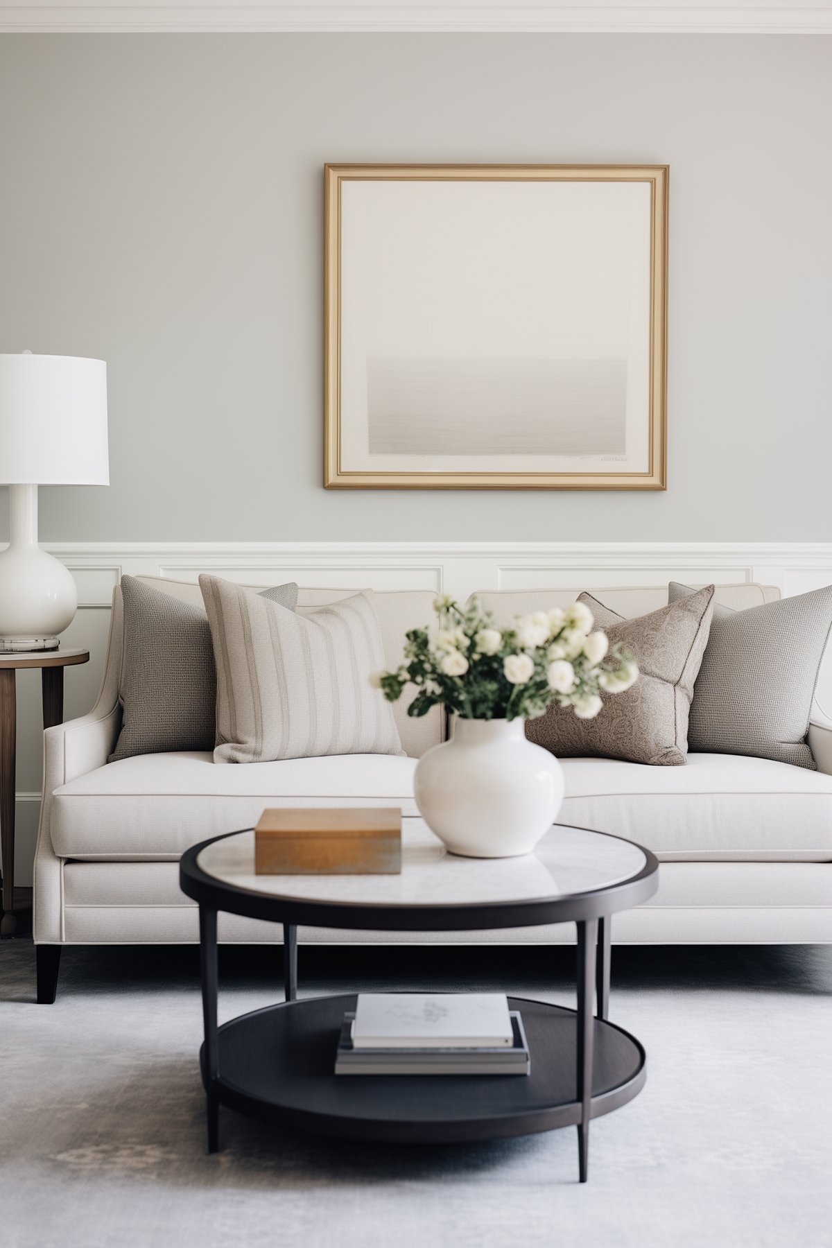
These paint colors work particularly well in bedrooms and bathrooms because they are soft, soothing and relaxing colors. We can all use more sleep so if a paint color can help, that’s even better!
The undertones of these grayish blue colors work really well as accents alongside the more common neutral color schemes, and can be excellent choices for a pop of color on cabinetry, furniture or doors.
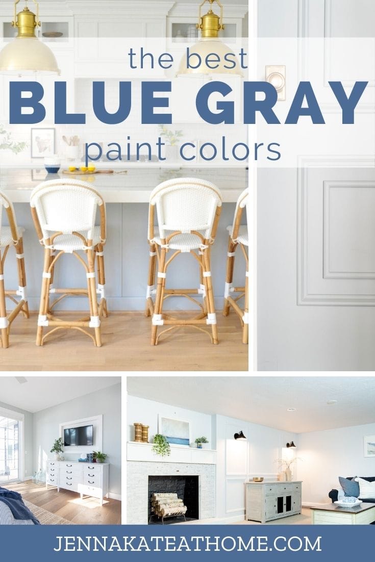
The blue gray colors that I’m sharing with you today are some of my favorite colors to work with, especially when trying to create a modern coastal feel.
However, these paint colors will work with any decorating style and in and room of your home – yes, they are inherently suited to bedrooms and bathrooms, but work equally well on living room walls, front doors and even kitchen cabinetry.
Personally, I like to stick with the colors that are closer to gray with a blue undertone, as they are a more neutral canvas for me to work with.
The colors that are a stronger blue tone work wonderfully when paired with white wainscoting, as a kitchen island color or even as a door or cabinet color. They also make for serene nursery, bedroom or bathroom paint colors.
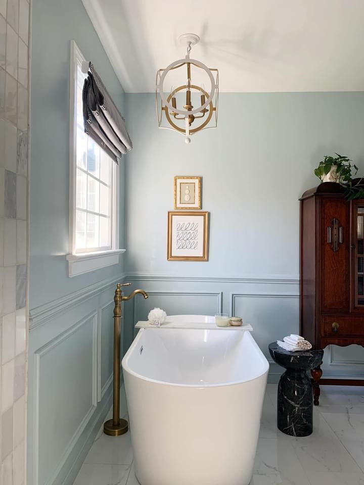
Where Can You Use Blue Gray Paint Colors?
Blue-gray paint colors are a versatile choice that can work well in various rooms of a house. The best rooms suited for blue-gray paint colors are those where you want to create a calming and relaxing atmosphere.
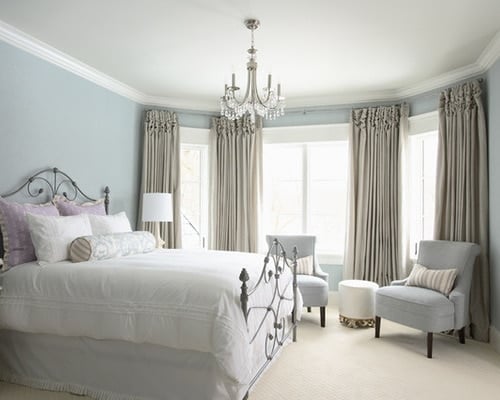
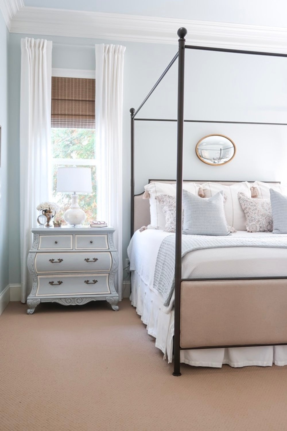
1. Use blue gray colors in bedrooms
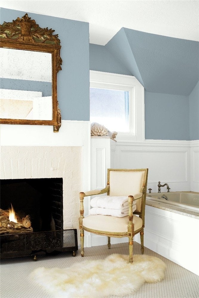
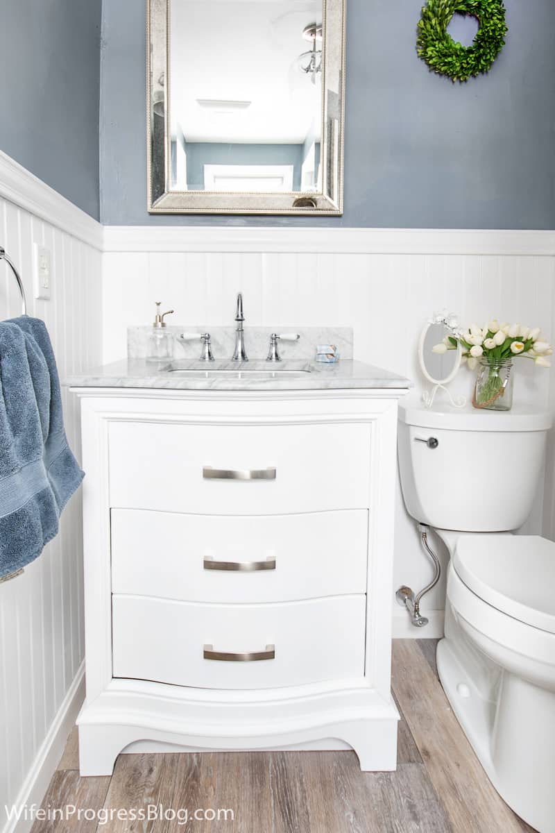
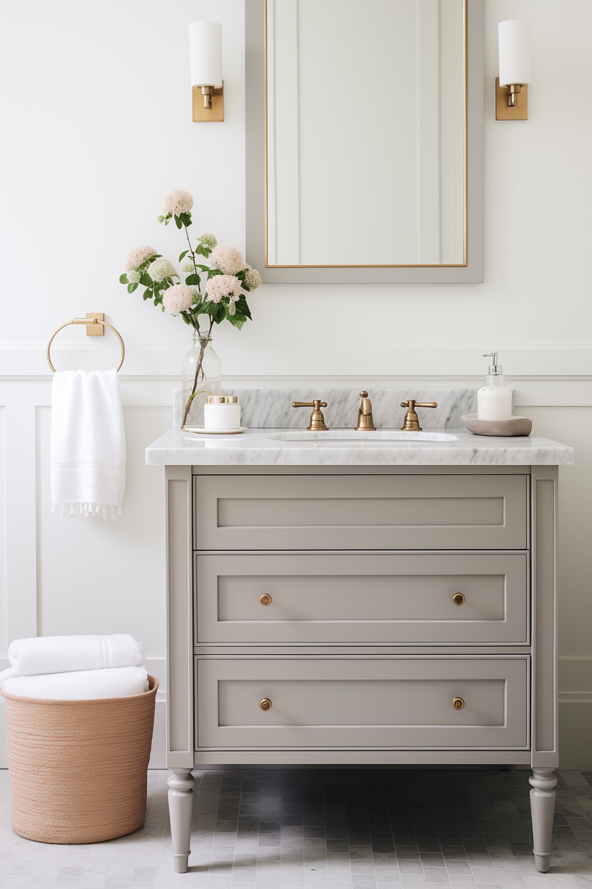
2. Blue grays are perfect for bathrooms
Cool blues create the perfect spa like vibe for a bathroom, especially when paired with crisp whites.
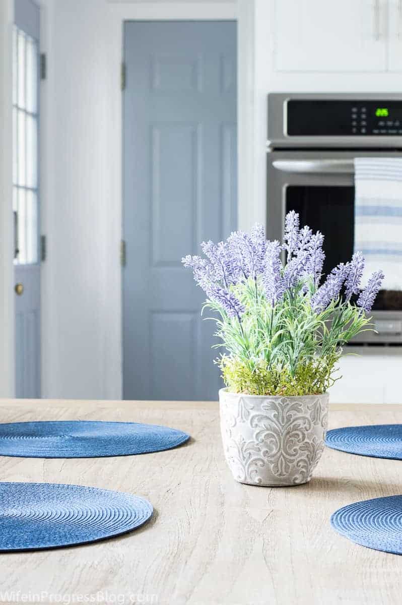
3. What about blue-gray colors in kitchens?
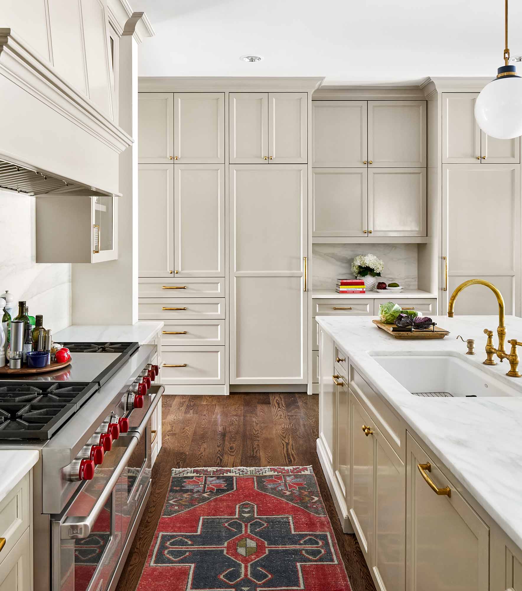
I don’t find blue-gray colors particular appealing on kitchen walls, but they are a great choice for cabinetry. Whether you go all in or just do your island in an accent color, these paint colors can look really pretty.
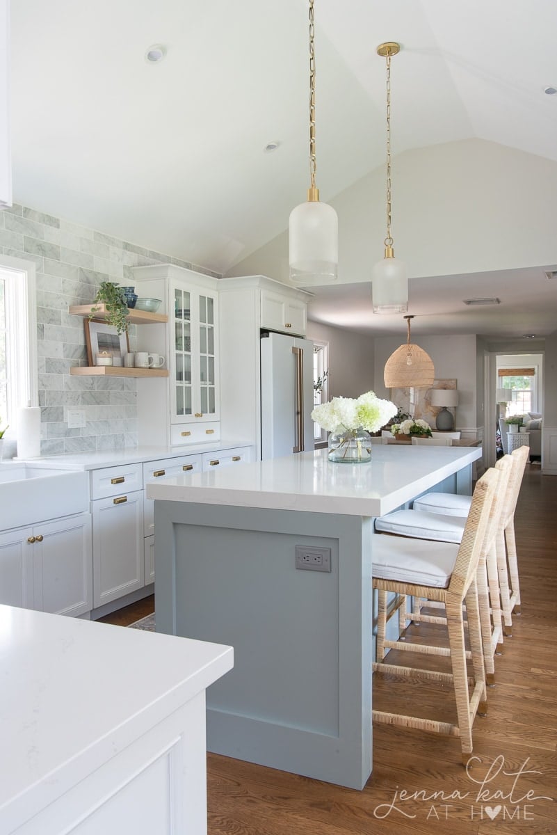
Pair them with warmer brass and wooden tones to help counteract the coolness of the blue and gray and you’ve got yourself a winner.
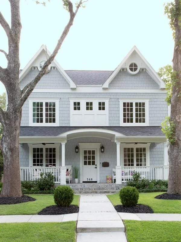
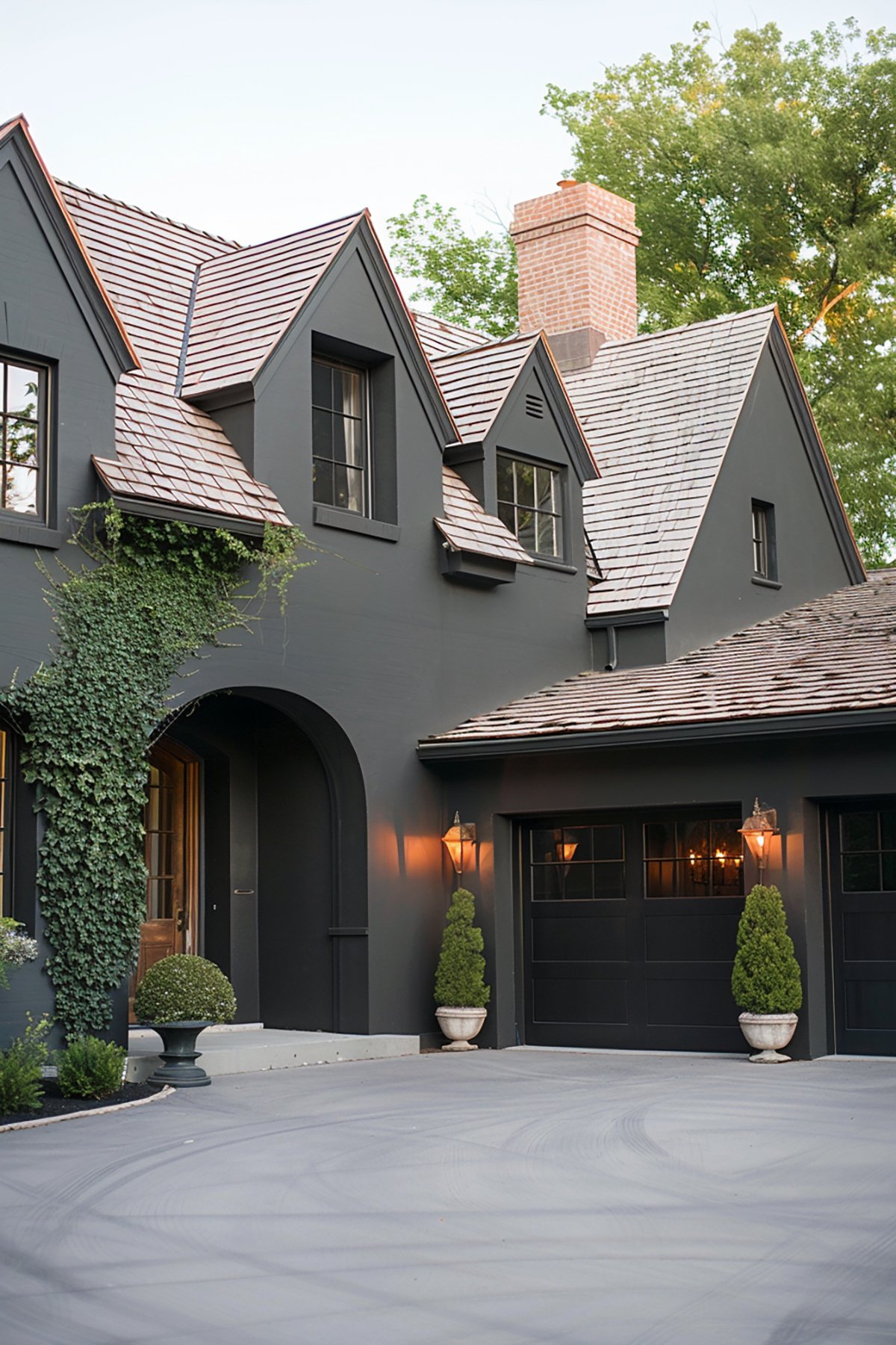
4. Blue Grays are perfect for exteriors too
Blue-gray paint colors are not limited to just bedrooms and bathrooms and cabinets. They can also work well as an exterior color.
How Light Can Affect The Color
When it comes to exposure, it’s important to consider the amount of natural light that the room receives. North-facing rooms tend to have a cooler and bluer light, so it’s best to use warmer blue-gray paint colors to create a balanced atmosphere.
In contrast, south-facing rooms have warmer and yellower light, which can make blue-gray paint colors appear cooler, so it’s best to use cooler blue-gray paint colors in these rooms.
Any of the shades would work for a stunning cabinet color. Get creative! Paint your bathroom vanity, kitchen island or laundry room cabinets for a a pretty pop of color against a neutral background.
Color Psychology of Blue-Gray Tones
- Calming Effect:
- Blue-gray is known for its calming and soothing effects. The blue component is often associated with tranquility, like the stillness of a calm sea or a clear sky.
- These colors can create a serene atmosphere in a space, making them popular choices for bedrooms, bathrooms, and spaces designed for relaxation.
- Versatility:
- The gray element adds a neutral, balanced quality, making these colors highly versatile and easy to pair with various interior design elements.
- Blue-gray tones can serve as a neutral backdrop or as subtle accents, complementing both contemporary and traditional styles.
- Elegance and Sophistication:
- Blue-gray shades are often associated with sophistication and elegance. They convey a sense of refined taste and understated luxury.
- In color psychology, these tones can impart a sense of stability and reliability, making them suitable for professional or formal settings.
Practical Applications and Tips
- Interior Design:
- Blue-gray colors work exceptionally well in achieving a minimalist and chic look. They pair beautifully with crisp whites, rich wood tones, and metallic accents.
- In areas with less natural light, opt for lighter shades of blue-gray to avoid making the space feel too dark.
- Exterior Use:
- For exteriors, blue-gray can offer a timeless and classic look. It’s particularly striking on exterior siding, doors, and trim, complementing natural surroundings like greenery and stone.
- Color Combinations:
- Blue-gray tones are versatile in color pairings. They complement warm colors like warm whites and beiges, as well as cooler tones like deep greens and purples.
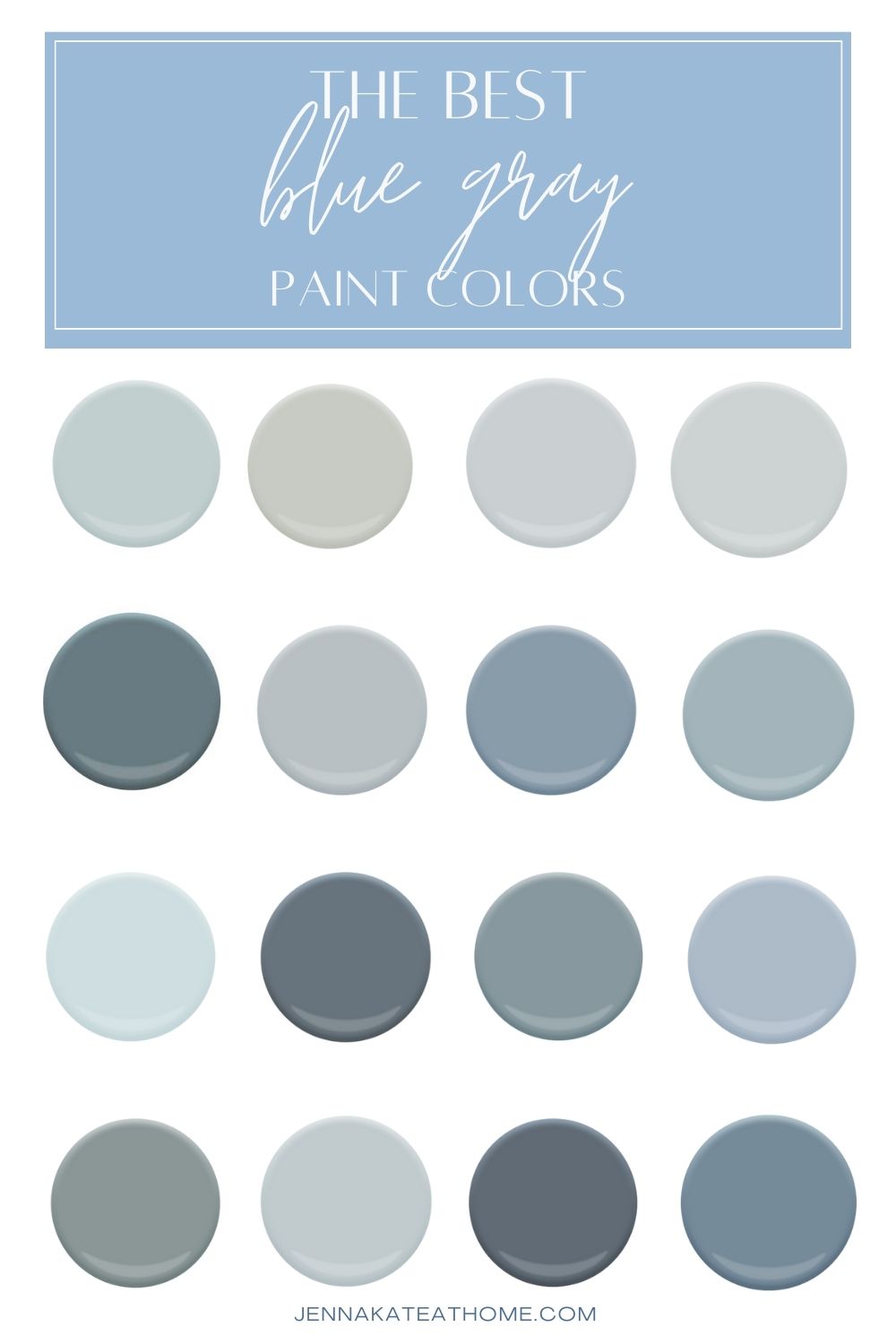
What Are The Most Popular Blue Gray Paint Colors?
To recap, there are several blue gray paint colors that have proven popular over and over again in recent years:
The Best Light Blue Grays from Benjamin Moore
- Benjamin Moore Boothbay Gray
- Benjamin Moore Santorini Blue
- Benjamin Moore Water’s Edge
- Benjamin Moore Nimbus Gray
- Benjamin Moore Summer Shower
- Benjamin Moore Smoke
- Benjamin Moore Gentle Gray
- Benjamin Moore Gray Wisp
- Benjamin Moore Arctic Gray
- Benjamin Moore Quiet Moments
- Benjamin Moore November Skies
The Best Light Blue Grays from Sherwin Williams
- Sherwin Williams Tradewind
- Sherwin Williams North Star
- Sherwin Williams Misty
- Sherwin Williams Krypton
- Sherwin Williams Morning Fog
- Sherwin Williams Silver Strand
- Sherwin Williams Upward
The Best Light Blue Grays from Behr
The Best Dark Blue Grays from Benjamin Moore
- Benjamin Moore Brewster Gray
- Benjamin Moore Britannia Blue
- Benjamin Moore Providence Blue
- Benjamin Moore Gentleman’s Gray
The Best Dark Blue Grays from Sherwin Williams
Frequently Asked Questions
Sherwin Williams Upward is the Sherwin Williamd Color of the Year for 2024.
Blue gray colors are cool colors, since both gray and blue have cool undertones.
Don’t Forget To Always Use Real Paint Samples!
Don’t forget – no matter what you’ve read or photos you’ve seen online, it’s really important to sample paint colors in your home before committing!
Samplize provides peel and stick paint samples made with real paint, that are easy to move around your home, and cheaper than buying a gazillion paint pots! It’s the only way I buy paint samples.
Final Thoughts
In conclusion, blue-gray paint colors are popular due to their calming and versatile nature. They add sophistication and elegance to any space while still providing a serene and relaxing atmosphere.
These colors work well in bedrooms, living rooms, and bathrooms, creating a soothing and calming environment. Whether you choose a light, airy blue-gray or a deep, moody blue-gray, these colors will add depth and character to your home.
I hope I’ve provided some inspiration for your future paint projects today! These blue gray paint shades are the perfect way to add a cool neutral, spa-like feeling to any room in your home

Funny that these blue grays are considered new and modern, I have always loved these colors! I’m 65, and we all used them back in the 80’s and 90’s when they were called dusty blues or country blues. I’m so happy to see them back in style!! Just don’t bring back dusty pink and mauve please!🤣
Thank you, Jenna…this is so helpful! Beautiful colors!
We used Benjamin Moore Chalk White in our slightly small master bathroom, and it is a beautiful shade of ever so light blue gray. It is so light and airy, we feel like we are in the clouds. We had BM Gray Timber Wolf in our old bathroom and it was very nice. Chalk white is the lightest color on the Gray Timber Wolf paint card. So so pretty!
Okay, really love how you describe every detail, it was very helpful cause now I found a color to paint my living room. Thank you.
What color white are you using to compliment these blue-grays. White white seems too white.
It depends! Plenty of people use bright whites for a coastal look, but if you want something softer then I particularly love SW Alabaster paired with a soft blue gray
I’m wanting to use silver strand in my living room but what color do I use with it. I want to put silver strand on the lower half and another color on the upper half.
Hello I am searching for a particular blue shade that I saw on Instagram. Would you help me pin point what shade of blue and maker it’s from if I were to share a picture of it ?
I can try! But your best bet is asking whoever posted it on Instagram!